::: Greetings from Critique Club :::
Hi, as requested, here is an indepth critique of your submission.
First Impression - the most important one:
Decent shot, but it could be improved in post.
Composition:
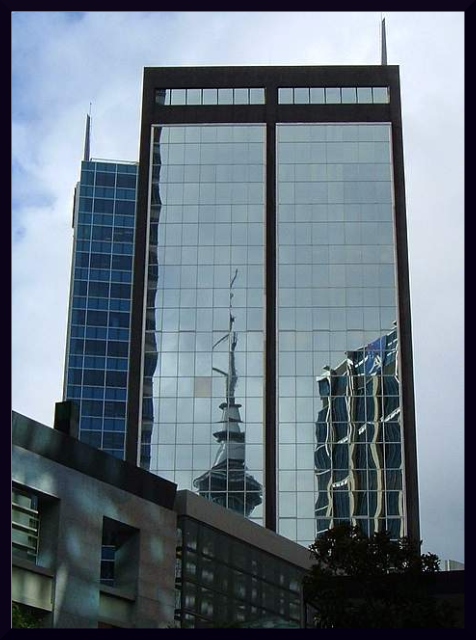
This is where I have some issues. The vertical lines at the top of the building lean inward. A bit of perspective change in photoshop could have fixed this and made this shot a lot better compositionally.
Subject:
It's there and in your face. Can't miss it :-)
Technical (Color, focus, and light):
Focus looks sharp. Lighting is pretty good, but may be a very little under-exposed. Color could use a bit of saturation boost.
To grow its vote?:
Good starting shot, but needs a bit more processing to make it pop.
Summary:
Not bad overall, I do like the shot.
Hope to see more from you soon,
Leroy |





 Add photograph to your favorites
 Add photographer to your favorites


 Photographer found comment helpful.


