Challenge:Architecture III (Advanced Editing IV) Camera:Panasonic DMC-FZ3 Location: Ornate building in my hometown, nearing sunset Date: May 26, 2006 Aperture: F4.0 ISO: 200 Shutter: 1/250 Date Uploaded: May 26, 2006
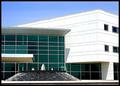
This is a downtown building in my hometown. I love the ornate toppers on the windows and because the glass is original to the building, it reflects the building across the street in a wavy pattern. The white reflection of the sun in the window across the street at the bottom was annoying.
*This is my very first Member Challenge entry!
Statistics
Place: 232 out of 281 Avg (all users): 5.0278 Avg (commenters): 6.0000 Avg (participants): 4.9417 Avg (non-participants): 5.1429 Views since voting: 791 Views during voting: 247 Votes: 180 Comments: 8 Favorites: 0
Congrats on your first entry in the members area Becky.
This is a beautiful place to photograph and I am sure if you take the comments into consideration and do a reshoot in six months, then you will be surprised with the result. It takes time Becky...!
Although you've taken a picture of a very interesting building, and the composition in general is interesting, there are a few techincial difficulties with your photograph that detract from the overall impact. For example, the lower portion of the frame shows a nice straight line that matches the frame, but the lines at the top of the building seem a bit distorted. This has the effect for me of skewing the entire composition in a distracting way. You have also elected to frame or crop the image in such a way that cuts out what looks to be an interesting structure at top, but your crop has left in a distracting element at extreme upper left. This is incongruous, to me, with the formal style of capturing the six windows in a very regular pattern.
You may have chosen to blur or tone down the reflections in the lower windows, which seem a bit busy, but it could be argued that they offer an interesting counter-balance to the deep blue reflections above. There are also some floodlights in the frame that detract somewhat. For some reason, the colour are a bit washed out. I don't know if this has to do with post-processing, or your camera, but there are probably rich colours in this scene that could have been improved upon in post.
Overall, though, the image is an interesting one. Generally the colours are good and add interest, and I personally like the very formal composition you've selected here. In future, you may consider taking shots from different angles, or using post-processing to enhance or tone down certain features in your photograph.
hmm, the reflections in the glass are very nice, maybe you could have just cropped out the top and bottom, so that only the 6 windows were left, and yes, straighten the pic out as best you can, maybe also brighten your colors and contrast, I agree with Rikki's comment and also, maybe there is some way you could have gotten rid of the bright spot between the last two windows on the bottom row... you've got the right idea though
This one is a bit washed out IMHO. The colors are there but just needs to be bumped just a tad for them to show up. The mis-aligned horizontals are a no-no in Architecture shots. The interest is there with the details but the window reflections do not in any way enhance the image. If there's a way that you can use a polarizer then by all means, do so. They take out reflections pretty well. There is some sort of barrel distortion happening to the image as seen in the horizontals which is also distracting. The use of three windows is good as most odd assymetrical compositions works well. The lights could have been cloned out as well since this was an advanced editing challenge.
Using a new formula....
Meets the Challenge = 2
Technical Merit = 1 (needs straightening on top)
Holds Interest = 2
Creativity = 1
The "wow factor" = 0 (taking one or two of the windows with those reflections would have achieved that wow)
Final score: 6







 Add photograph to your favorites
 Add photographer to your favorites

 Photographer found comment helpful.


