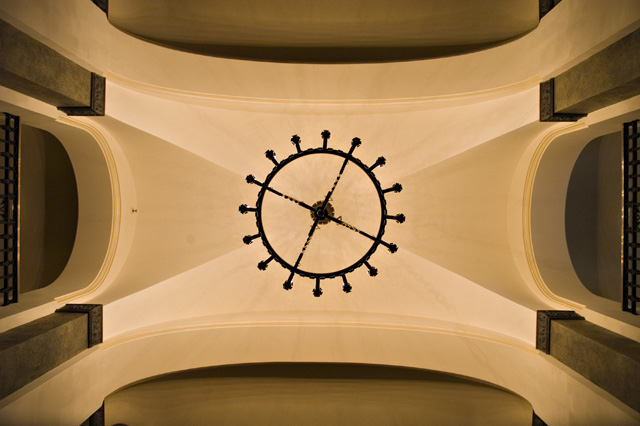
Shot in the Banff Springs Hotel with my friend\'s D100.
Had to lay down on the floor to get this shot. This is very different than I would normally submit so we will see if it does much better than previous submits.
Just edited levels and contrast/brightness
Cloned out dust spot.
Statistics
Place: 190 out of 281 Avg (all users): 5.3167 Avg (commenters): 6.2000 Avg (participants): 5.1900 Avg (non-participants): 5.4750 Views since voting: 966 Views during voting: 269 Votes: 180 Comments: 8 Favorites: 0
First, let me say that I am not a professional or even a very good amature photographer, so you may want to take my comments with a grain of salt.
Meeting the Challenge: Great job here of course.
Composition: Perfect. You hear so much about the rule of thirds but sometimes it just makes sense to not follow it, and if done correctly, like here, I think those can be some of the most interesting photos. I may have cropped off a tiny bit of the top and bottom, to eliminate the black bump at the bottom left, but this is pretty minor.
Lighting: Seems very good. Every shape is emphasized and separate, while being a part of the complete whole.
Camera Work: You should be proud of what you did to get this great shot!!
Post Processing: Seems like you did a great job with the steps you took. I would have also cloned out the line on the middle arch on the left also, to preserve the symmetry.
Title: I like it. While your perspective is pretty self-explanatority, I would think, it is possible to be confusing to some and the title gives viewers a good reference.
Image Dimensions and Filesize: The filesize should be as close to 150kb as possible to minimize compression artifacts.
Misc / My subjective thoughts: I like seeing different approaches to things, symmetry that works, colors that blend and flow together... in short, I had a great time viewing and critiquing this photo. Thanks!
I hope this helps! Feel free to PM me if you have any questions.
don't care for this at all. Looks like a poorly drawn paintshop image. The prespetive is almost interesting, but the image itself is two even. Needless to say, this could be totaly true of this design, but, just looks fake to me.






 Add photograph to your favorites
 Add photographer to your favorites

 Photographer found comment helpful.


