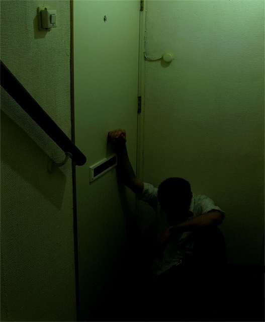
Compositionally, this works well because the main subject is at the bottom right of the frame, but the the handrail leads the eye through and down the frame to him. That is a very effective technique, I believe and makes the composition stronger. The switch and the little round thing are a bit distracting. Since this was advanced editing, you could have cloned those out, or you could crop it lower and still maintain your basic overall composition. I would probably recommend the former more because having a vertical crop gives it a "deeper" feeling.
Technically, the low exposure kinda of hurts. I have a super bright (almost too bright) monitor, and the bottom details are all but obscured for me. I can see his heads and arm, and that is almost all. I see your aperture is 22. I would think you could get by with a much lower number. This would help the exposure, and even help you use a faster shutter speed as well, so your subject would have to be as still.
The green has an interesting effect on me. It is a cool color, and would normally be calming, but in this shot it is having the opposite effect. Perhaps because it is a little on the yellow side, or because the bottom is darker.
Again, I think you had a really good, powerful idea. Unfortunately, it gets lost in the darkness.
This is a case where the things that I would usually want to change actually enhance the image. You show great courage submitting this to the sometimes insensitive dpchallenge audience. Great job. You inspire me. 10.
Not sure if the green was done for effect, it doesn't do much for me. His pose does give an impression of his mood but I would have liked some light on his face too. It is a good concept amd no doubt others will love it!





 Add photograph to your favorites
 Add photographer to your favorites

 Photographer found comment helpful.


