hi, all
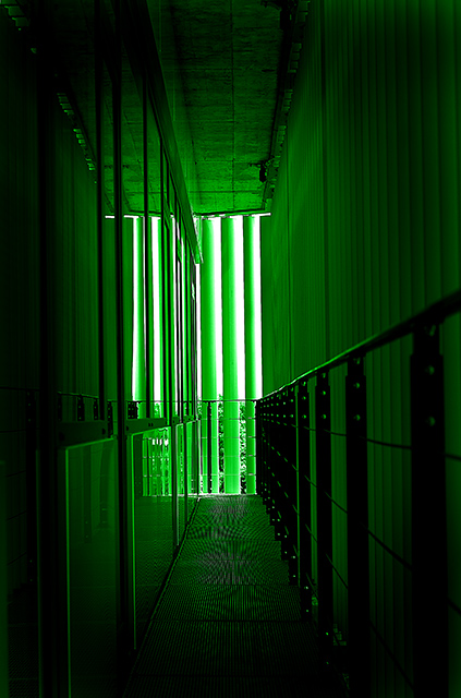
this is the balcony/corridor on my floor in our new company building with big automatic sun shades, the perspective shoot was always pulling me to the balcony and this architecture challenge was a nice opportunity to take a photograph of it
exif:
Model Canon EOS 350D DIGITAL
Date/time original 25.5.2006 14:19:32
Shutter speed value 1/250 s
Aperture value f/5.6
ISO speed ratings ISO 100
Exposure bias value 0.00 eV
Metering mode Average
Flash Flash did not fire, compulsory flash mode
Focal length 50 mm
White balance Auto white balance
postprocessing:
usm
grayscale
8 bits/channel
duotone
levels
burn
RGB color
color balance
burn
usm
brightness/contrast
burn
Statistics
Place: 176 out of 281 Avg (all users): 5.3784 Avg (commenters): 5.8333 Avg (participants): 5.2000 Avg (non-participants): 5.6125 Views since voting: 1130 Views during voting: 278 Votes: 185 Comments: 11 Favorites: 1 (view)
I think it is something to do with some sweets from childhood called Spangles that makes me love this colour - I have at least two challenge entries using this shade;) Or may be I'm in the matrix? So I'm in love with your entry before I even start!
There are so many different textures here: That lovely moire type pattern on the metal is really nice. The rivets on the right hand guard rail are nicely highlighted. The vertical lines on the right wall. The glass and reflections of the left hand wall and the stippled ceiling tiles. A true selection box!
The eye is definitely drawn towards the light here, as though it's as escape route from the matrix! The different lines do make you stop and look along the way out though, so the image holds the viewer's attention.
The focus is wonderfully crisp and the septh of field does it's job well.
As for meeting the challenge - some architect obvioulsly put a lot of thought and design into this small space; to say it doesn't scream architecture is a little harsh.
Well looks like you had the last image in the que. I like the green kinda matrix look to this and I guess that is what you were after. I also like how the walkway seems almost like tv screens. I really like how all the lines lead my eye to the center of your image. Nicely done. I really like the depth of field. I like that some of the railing close to the viewer is out of focus. Very nice image.
First, let me say that I am not a professional or even a very good amature photographer, so you may want to take my comments with a grain of salt.
Meeting the Challenge: It doesn't scream "architecture" to me right away, but even still I feel it definitely does meet the challenge. Many others probably disagreed with me. (edit to explain: The actual space is of course a wonderfully fine example of archetecture. I just mean that with the colors how they are, and with the reflections, it may be hard to tell at first glance, or from the thumbnail, that this does meet the challenge.)
Composition: I like how the main, "highlighted" portion is off centered while still feeling very balanced. The lines in the photo really appeal to me, and unlike a previous commenter, I like the patterns on the floor.
Lighting: Good. I can see plenty of details. The only thing I'd suggest, perhaps, is a bit brighter foreground to pull out the details there, although I can't make up my mind if this would be an actual improvement.
Color: I love what you have done in postprocessing.
Title: Describes the picture without stating something obvious. To me, that makes a great title. The title describes the effect you've achieved perfectly, in my opinion.
Image Dimensions and Filesize: No problems here.
Misc / My subjective thoughts: I love green, so your image pulls me in immediately. I think it is a bit of a unique photo for something like this, and maybe with something more traditional you would have scored higher in this challenge. However, I am glad you entered what you did, and it is definitely going in my favorites.
I hope this helps! Feel free to PM me if you have any questions.
Hi, as requested, here is an indepth critique of your submission.
Oh and I have good news. Your photo is the last entry in the CC queue. It's the first time we've emptied the queue. So you get something special with this photo.
First Impression - the most important one: This shot does take a lot of look of The Matrix movies and I think it's pretty neat looking. Definitely a creative take on window blinds :-)
Composition: Interesting. I like how you have made the corridor lead to the end of the hall. Definitely draws the eyes down the corridor.
Subject: Not really applicable to this shot.
Technical (Color, focus, and light): Color: Definitely works for what you were trying to do.
Focus: Seems sharp and DOF is deep enough to work for you.
Light: I like how it falls off as it comes toward the camera. Very nice effect.
To grow its vote?: I'm not sure that it worked for the voters. It's less of an "architecture" shot than most would expect.
Summary: Creative entry and shows competence on your part. Keep up the nice work.





 Add photograph to your favorites
 Add photographer to your favorites

 Photographer found comment helpful.


