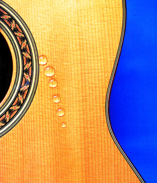
I'm a massive Beatles fan, but knew that I was better off choosing a relativly well known title! Loved doing this challenge. I think the best part was thinking of what I could do for all the titles! Settled on one of my favourite songs 'While My Guitar Gently Weeps' from the White Album. Hope it does OK.
I know the water (or 'tear') drops aren't quite right, but time was a HUGH constraint, but that would be an excuse, and I don't like excuses! Basically I cocked the water up!
PP in PS CS:
Cropped and straightend
Hue/Sat layer to increase Sat by +22
Curves layer to improve contrast
Selective Color layer to deepen black
Clone tool to make the box hole really black, and to get rid of some reflections.
Re-size for web, cross fingers and pray!
Statistics
Place: 24 out of 273 Avg (all users): 6.4132 Avg (commenters): 7.3333 Avg (participants): 6.1500 Avg (non-participants): 6.5532 Views since voting: 3397 Views during voting: 485 Votes: 288 Comments: 30 Favorites: 4 (view)
I'm not a real Beatles fan, but I recently saw the tribute concert for George Harrison, where Eric Clapton and Harrison's son (who is the double of his father!!!) and others sing this song. It gave me goosebumps and brought a tear to my eye.
This is a bold and striking image.
I like the deep blue that contrasts well against the yellow. The blue could dominate here, but as you have made sure it only occupies less than a third of the image, it supports, rather than takes over. The sinuous shape of the guitar creates lovely negative space in that blue. The dark black highlights and echos the curve even more.
The box hole also creates a nice shape that compliments the curve on the other side, and the water droplets create yet another shape. So you have lovely colour and lovely shapes, that are both really easy on the eye.
The water droplets...reading the comments, it seems the voters wanted perfection! They wanted them to look like real tears...I think you could have invested hours, days or months trying to capture tears, ended up weeping yourself, and STILL someone would have said they are not realistic enough:))
I like the regularity of the drops, I like the line they follow as it gives a graphic feel. I like the orange hue they have taken on around the edge.
My only nitpik is that the top of the guitar seems a little overexposed losing a little detail in the texture of the wood.
Minimilistic and simply stated - the photo grabs the eyes attention and holds it with the bold colors (the brilliant blue backdrop and the rich yellow hue of the guitar) and the shaped curves. The only critiques I have on the piece as it relates to the challenge is that those brilliant bold colors project a "happy" mood which is a direct contrast to the tone & mood of the Beatles song you are capturing (which is sad and heavy-hearted). The water drops do their best to project the idea of the guitar weeping, but I feel it can be improved if each drop was not uniform in shape. Perhaps if they (and this would be challenging I know but it would be worth it) were more in the classic teardrop shape. Water droplets in that shape would create a much stronger impact and connection to the guitar weeping.
Nice image - only suggestion is that the drops be more globular. A small amount of wax polish, some glycerine in the water to give it density... my suggestions.
Excellent interpretation. Blue background may be a smidge too vibrant (it really pulls my eye away from drops and guitar) but a great job overall. I give it a 9.
I like this, but I think if they were trailing down like tears, it would really work better. Lovely focus and the complementary blue background jumps out at you. Maybe "drops of Jupiter" would work better, but that's a different group. LOL







 Add photograph to your favorites
 Add photographer to your favorites

 Photographer found comment helpful.


