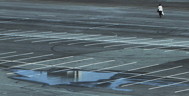
Thank you for the critique, Makka. The problem is, everything you (and Crisik) have pointed out as shortcomings is there on purpose. The car park is flat looking on purpose. The puddle is there on purpose. The diagonal white lines are there on purpose. The noise is there on purpose. I believe all of that adds to the mood. I have put a lot of work into this image to have it exactly match my vision.
But of course, I can't expect the voters' tastes to match mine.
This photo definately matches your title! The main thing that strikes me in this photo is that puddle of water in the foreground. I think it takes away from the person walking in the distance. It's hard to tell without seeing the original photo but maybe a different crop may of helped save this one. It's worth trying a few variations for yourself and see what hits you the best.
You've used a nice DOF here to get a good focus over the whole image. You could of used some slight dodge and burn to add a bit of character to the car park perhaps just to give the photo a bit of pop as it's a little flat looking.
All up, there are a few things you could of done with this to help with the voters because of the advanced editing rules. Still, a 5.35 is nothing to be sneezed at and sits well above your average. Keep at it Nikita and best of luck in future challenges.
Well, i wouldnt say all of the better scoring photos were worse than this one.
I gave 6 myself since I like the concept and composition, on the other hand it seems noisy (even at ISO 50 which is suprising) and those white lines are quite distracting - were there only concrete w/ the puddle and neat image, I guess it would score higher.
I must say I'm disappointed with the low score this photo got. Three of my photos scored better than it; and all three are, in my opinion, much worse. Oh well.
i really love your take on the challenge. great image for the lyric and it LOOKS like a part of a music video. i love the lines of the lot and how tiny the person looks. i wish the person was a little further down in the composition (i missed them at first glance) and b/w may add to this shot. otherwise great!
Great idea for the shot and kudos on having the camera there. However I'm a little off on the idea of having the subject jammed so far up into a corner...
TC







 Add photograph to your favorites
 Add photographer to your favorites


