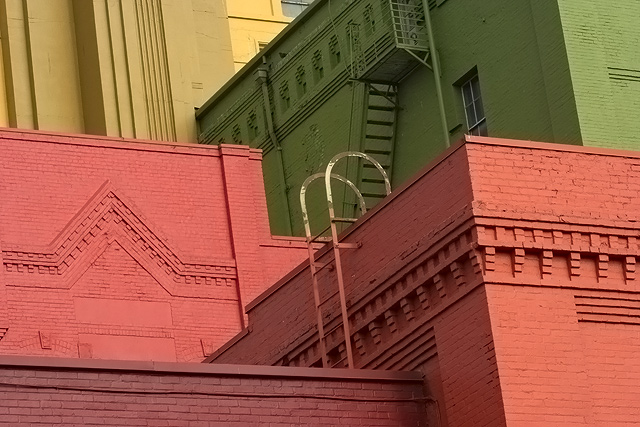
This is such an interesting architectural find...great buildings with rich colors and textures. I think you have a great start to a wonderful photo, but there are a couple of things that I think you could try to really make this "pop."
The lines on the edges of the buildings are all leaning in due to parallax (which is not your fault), but can easily be corrected in editing. If you have PS CS2, you can use the Distort>>Lens Distortion tool and fix it in a snap. Straigtening the edges would go a long way to help the image feel more balanced.
The colors could use a slight boost in both contrast and saturation, at least when viewed on this LCD panel monitor at work. Maybe a little bit of dodging in the shadows as well, but you'd have to be very careful with that as it adds noise.
Lastly, I'd suggest cropping out the top little bit, down to where you can no longer see that tiny bit of window in the center. It doesn't add anything compositionally and I think it kind of distracts the eyes a little.
Overall, this is a great image that has some fine points and some points upon which improvements can be made. If you have any questions, please let me know! :)
I like the colours and wonder if this is a find or a fix? but not sure which architecture im supposed to look at. The ladder curve gives focal point, but really doesn't give me a feel for the architecture of it.





 Add photograph to your favorites
 Add photographer to your favorites

 Photographer found comment helpful.


