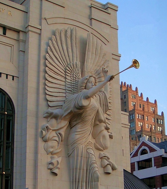
The brightness behind it (That' the Blackstone if I am not mistaken)draws my eye away form the main subject. perhaps an angle more in front would give the look you wanted without distractions.
Technically this is a fine picture. However it is better if the subject isn't centered. Since she is aimed toward the right, it would be better if she were at the left of the frame (this would also get the annoying door outside of the frame). Also, why are her feet missing?
You've got what appears to be some distortion going on here. The buildings on the right lean to the left, and the main building on the left is leaning right. Some distortion correction might help this a bit. It's not major, but distracts some for me.
Focus and clarity are really good. We get to see lots of the detail in the angel.
I'm seeing this as more of a photo of the angel than a photo of the building though. I mean, it is part OF the architecture, but I'd like to see more of that building.
The lighting on the front of the building looks to me to be a bit too dark. The color is muted and I'd like to see just a bit more contrast in the front. I wonder if some extra adjustments to the brightness/contrast might have helped enhance the look of the lighting there.
The door on the left is a bit of a distraction since it is so dark against the rest of the photo which is all lighter colors.
The sky is a nice blue, not blown out or too bright.
Technically, it's a good shot, it's just lacking a little something to make it 'great'.
~Heather~
Curious, why'd you cut off her feet? The angel dominates so much of the shot that, IMO, it would have been better to zoom out just enough to include all of her in the shot, and still have the architecture in the background, too.





 Add photograph to your favorites
 Add photographer to your favorites


 Photographer found comment helpful.


