Hi, as requested, here is an indepth critique of your submission.
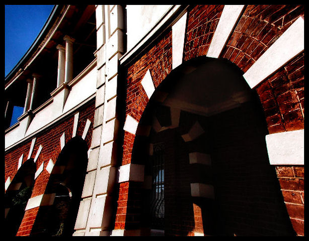
First Impression - the most important one: Interesting image, but comes across as over-processed.
Composition: I'm not liking the fish-eye look on this image. Using the fisheye is fine, but should later be de-fished in PS with this type of shot.
Subject: n/a
Technical (Color, focus, and light): Color is a bit over-saturated, also seeing some artifacting in the sky.
Focus: Could be a bit sharper, details just aren't coming through for me. Isuspect you sed a fish-eye adapter in front of a P&S camera and has probably hurt the focus some.
Lighting: seems like it was nice, but over-processing has lost a lot of detail inside the arches.
To grow its vote?: A little less processing probably would have helped on this one. Also, the defishing that I mentioned earlier.
Summary: Overall, interesting shot. Keep at it. :-)
I agree with the posts below. black arch-way and fish eye look aren't really complementing, the colors are nice, but the focus needs to be sharper to bring out the textures, also maybe a different angle could make this photo more interesting, I like the border though, I think it goes well with the dark red, white and black of the image






 Add photograph to your favorites
 Add photographer to your favorites

 Photographer found comment helpful.


