Challenge:Success (Basic Editing III) Camera:Sony DSC-S90 Location: my house Date: May 23, 2006 Aperture: f 2.8 ISO: 160 Shutter: 13 Galleries:Sports Date Uploaded: May 23, 2006
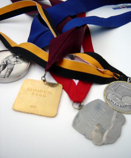
Camera Work/Technical: As you mentioned and everyone that commented noticed, the medals are not focused. Keep in mind that the Photographer's Comments are not visible during voting. Without those, it just looks like the focus problem was an accident rather than a design.
Lighting: The lighting is nice and even, but has a flat feel to it. I think that this one could have used a slight curves adjustment to give it some needed contrast.
Composition/Content: I like the composition that you created here. The ribbons and medals work very well together to draw the viewer's eye in and around the frame. Starting with the medals, everything flows very well deep into the image.
My Opinion: Most of the time voters here like vivid colors, crisp focus, or images from a third world country. As it is, I think that this one scored pretty close to is potential. With better focus and a bit more contrast, your score would have greatly improved. You did a nice job with composition, as well as meeting the challenge.
nice concept. Make sure when using the auto focus you focus on areas of high contrast like the edge of the medal. It sort of looks like your camera caught the white instead.
A picture like this one depends on critical sharpness and a really great arrangement. Your arrangement is nice, but not spectacular and the picture doesn't seem sharp enough, especially in the foreground.






 Add photograph to your favorites
 Add photographer to your favorites

 Photographer found comment helpful.


