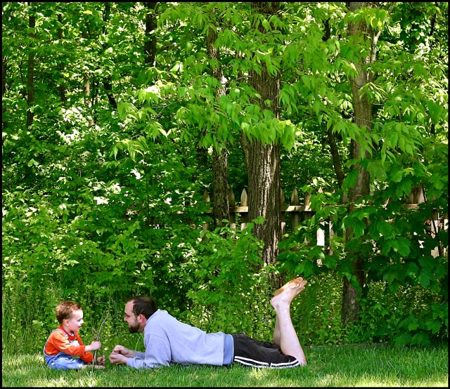
Had a hard time coming up with something for this challenge. Had entered a shot into failure but felt less than ok with it. Thought I would take some shots of me and my kids and see what came up. It seems as though its been a while since entering a pic of my kid so here it goes again.
3pm sun. Had the crop right at the shade line. Set the timer and then ran to get back in frame. Cropped, various level adjustments, saturation adjustments, sharpen, gaussian blur, border save for web.
I dont expect this to do great or even fair. I can take that. I just like this shot and he is my greatest success story. 10 minutes after shooting this he was on his way to his room with two spankings. Should have taken a pic of that and entered it in failures.
Statistics
Place: 61 out of 184 Avg (all users): 5.4424 Avg (commenters): 6.7500 Avg (participants): 5.0400 Avg (non-participants): 5.5629 Views since voting: 1191 Views during voting: 303 Votes: 217 Comments: 11 Favorites: 1 (view)
I think that the idea here was good, but the execution was lacking. I think it does show success in a certain way. I also think that many really don't understand success in a healthy manner, which leads them not to understand how this fits the challenge.
The execution part: Portraits of any kind, even far away and under trees, are better with directional lighting than with full daylight. The light is so incredibly even on you, that it almost seems you could be pasted in. I'm thinking you may have meant for the shaft of light to highlight your son, but the light then became too harsh. Also, this shot setup I think works better with much negative space instead of busy space that you see here. Maybe you two sitting on a hillside with mostly blue sky above you. Maybe that or this in provia black and white.
I also get in those moods where I just want to take a picture for me and ignore all the artsy crud, but I and you should probably resist entering these photo's, and just enjoy them on our walls. (I also do stupid too-literal stuff like my bokeh entry)
I think this is a beautiful family portrait, composition is pretty good, could use some crop of the top to make it 4X5 ratio.
the colors are great, and the focus is good.
the only thing wrong is that it doesn't show success.
Composition I like how the subject is in the corner, but I think there is too much negative space - or at least not the right negative space - could have been better had you for example been on a hill, with a simple b/g, just grass and sky.
Technical stuff (exposure, dof, lighting etc…) I like the dappled natural light, especially on your son, although theres a bit that seems a litte blown on his face
Message/atmosphere portrayed Gives a nice happy, summery kinda feel, which fits the subject
Meeting the challenge Yes, interesting take on the theme.
Other Muddy soles of feet bug me :P
My personal opinion The b/g is too distracting, but other than that its good. I think it scored reasonably fairly
Camera Work/Technical: Everything seems well focused, but your subject is also a bit small. WB is on as your colors really pop, giving a great spring time feel.
Lighting: The lighting is a bit splotchy, with some mildly distracting highlights on the child, as well as the green grass in the foreground.
Composition/Content: Nice composition, but a bit distant. I do like how the two of you are riding close to the bottom left of the frame. The child, then you, then the tree provide for some very interesting leading lines that keep the eye moving around the frame.
My Opinion: This is a high-quality snapshot that I am sure will please for years to come. I think that you met he challenge very well, but I don't think it was exactly what the voters were looking for. Then again, who ever knows what the voters are really looking for some days.
I certainly agree with the concept and the position of you two is good relative to each other. However, I think the trees vie too much for attention. They aren't adding to the relationship and, beyond being a pretty shade of green, they are making the photo unnecessarily busy IMHO. I didn't vote in this challenge but would have given this a 5 or 6.
Trading Post comment
This is a very engaging photograph that makes you linger. The eye is immediately drawn to the two people on the ground, then to the face of the child, then it wanders to the foliage behind. It does make one want to see the faces a bit closer, which in this size/format, is tough. It has a sweet innocence to it. Why didn't it score higher? Probably because of the first thing I mentioned - DPC tends to be a "2 second view" when voting kind of situation. Nit - the bottom of your foot seems to have an odd shadow/color to it.
Trading post...
This is a cute shot. I like the setup and your little boy is adorable. The top (bottom) of the one foot is very distracting though. I'm not sure if that's a blow out or maybe grass stains, LOL.







 Add photograph to your favorites
 Add photographer to your favorites

 Photographer found comment helpful.


