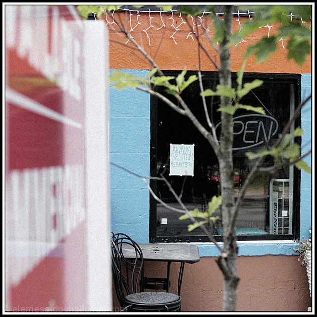
It took me a few seconds to understand this image. The message you are trying to convey isn't quite obvious enough for viewers that vote here. Great coloring and interesting composition, but the sign to the left is a bit difficult to see at first. Keep in mind that voters only spend a few seconds on each image here. This one was likely passed over with lower votes since it didn't jump out with the obvious challenge detail.
You don't make it clear where failure falls into this photo. The image has a tree right in the path of sight, which distracts from the whats in the windo. The window also has too much of a reflection. everytime I look at the window I'm first drawn to the open sign, then the red car in the background and finally the alarm sign.







 Add photograph to your favorites
 Add photographer to your favorites


 Photographer found comment helpful.


