Hi Kita. Let me just say you are on a roll here! Eight favorites in your last two entries is fantastic. Ok on to the critique.
Technicals: Overall good lighting. The subject is well lit and has no harsh highlights. I like the DOF. Everything that should be sharp is. Great job all the way around.
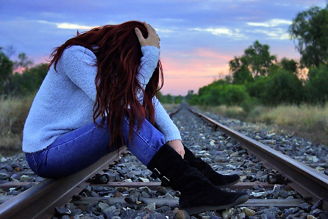
Subject/composition: Good choice in subject. The image is very somber and one can easily see failure in it. The railroad locale is a very good choice especially since they are classic symbols of running away, moving on or making some kind of life altering change. Couple that with your model sitting there in distress and immediately I think of a 100 things that might have failed here. I think this entry did a better job of depicting failure than the one that won the blue ribbon. So great job in meeting/exceeding the challenge theme.
As far as the composition is concern, the main subject is off-center and to the left which works out well. There's also good space around the subject and nothing that distracts the image in the least.
Post Processing: Everything looks good here. However, for this particular challenge I think I might have tried to tone down the colors just a bit. The blues in particular seem a bit too vibrant for such a somber image. Maybe just dull the blues a bit or a selective desaturation of just your model could heighten the somber feel of this.
One other thing about your processing. Your neatimage looks good however I would think about scaling back the effect on just the sweater. Since the sweater has a lot of small details to it the noise won't be noticable if you left it in there and that way you would avoid the smoothing effects neatimage tends to leave in certain spots. Probably the best way to do that is to use the history brush set to a point in the history before you ran neatimage and then just paint over the sweater to remove the neatimage effect in that area.
Well that's it. Really a great image all the way around. You have a super model to work with and a great teacher and mom also! I really look forward to seeing more of your photos. Keep up the good work!
I think the model's distressed because she's not going to beat her daughter in a challenge again :)
Very nice work. I could read into this that the bright colours of the clothing and the landscape represent what is wonderful in the world and then the fact that there is no direct light on the model and the landscape represents the despair, the disappearance or subdual of the light or hope. But maybe I'm just making all that up...
Good picture, nice composition.
Try out a b&w version too, it might make it more dramatic. And try to bring out the subject a bit more from the bakground.
distress is just that ... often it is not failure .. I can't see failure in this shot .. lovely colours .. well cropped and composed .. nice DOF .. and good contrast within the image.
I really like this.. Love the coloring you have.. The ladies two different colors, and the sky.. Also the grayish blue of the tract.. Suits the theme.. Good job..
I like the colors, the composition and the great leading lines. The exposure and depth of field are also really great, but I don't really get a sense of failure from this one. Hopeless, but not particularly failure.
What a great shot! :) The colors are rich and poweful, the contrast between highlights and shadows is strong, and the pose of the model (along with the setting) convey the title perfectly. Well done!






 Add photograph to your favorites
 Add photographer to your favorites

 Photographer found comment helpful.


