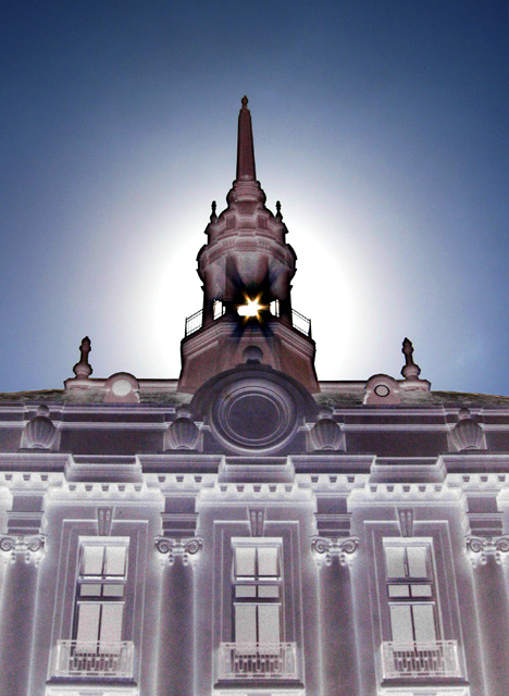
Cupola and roofline of Old City Hall with sun poking through the opening. With the building in near-silhouette, I used one RGB Curve to almost invert the dark tones and bring out the detail in the building, and to add color to the sky.
-Cloned-out two tiny flare-spots on the central escutcheon
-RGB Curve
-Slight rotation and crop
-Resized for DPC
-USM at 12%/48 dia/TH=0
-SaveAs PEG at quality 8/10 = 124kb
Statistics
Place: 264 out of 281 Avg (all users): 4.7433 Avg (commenters): 4.8000 Avg (participants): 4.6476 Avg (non-participants): 4.8659 Views since voting: 1397 Views during voting: 276 Votes: 187 Comments: 15 Favorites: 0
Oh this just doesn't work for me, the negative image loses much of the lovely architectural details.
Actually, the whole purpose of the post-processing was to allow the details to be seen at all, as this link to a resized-only original help show may show.
I wanted the sunburst through the cupola, and this was the position and angle where that occurs -- earlier in the day, you'd have to stand in the middle of a busy four-lane street ... in front of the police station and jail ...
I tried some horizontal ones, but they weren't as good.
Mostly I was impressed with myself for getting the sunburst and getting it that straight and symmetrical with a handheld shot.
Here's a link to a screenshot showing the single RGB Curve I ended up using (you can see I tried others). The numbers in the Info Window are being sampled from the center-underside of the cupola.
Camera Work/Technical: As far as I can tel everything looks nicely focused. This reminds me of the negative image challenge, as well as the hope that I would never again have to look at negative images. Your post-processing provides a very interesting effect, only rendering part of the image as a negative. I like it, and its much easier to look at.
Lighting: Wonderful use of natural light to produce a great foreground, and a background that is very interesting despite a little of overexposure. The time of day that you chose worked very well for this image.
Composition/Content: The composition feels a little crowded. I do like the perfectly centered composition, but I think I;d rather see a bit more of the building. Perhaps this exact setup, but turning the camera to landscape rather than portrait.
My Opinion: What you produced here is not something that I normally prefer, but I strongly disagree with the score. There is no way that this is a sub-5 photo. Nicely seen and interestingly processed.








 Add photograph to your favorites
 Add photographer to your favorites


 Photographer found comment helpful.


