|
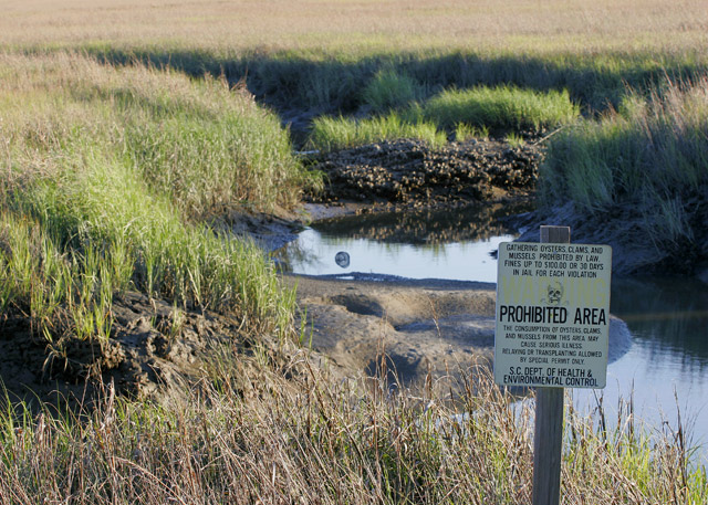
I like the idea, and I think that you meet the challenge, but there really isn't enough emphasis on the sign. I think a tighter composition with a more shallow depth of field would help direct the viewer more toward the warning, while still seeing a blurred environment in the background. |






 Add photograph to your favorites
 Add photographer to your favorites


 Photographer found comment helpful.


