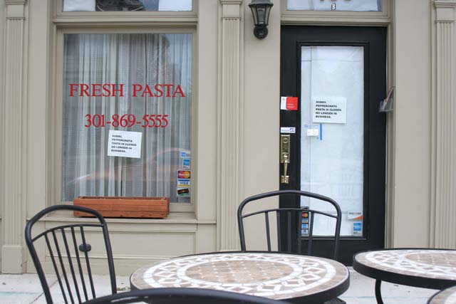
Ok, you know what the main problem was here;) I like scenes like this, and the idea was good, but without the sign being legible, the story you were trying to tell got lost.
I too have problems (who knows why) keeping the camera horizontal, and you rotated to compensate, but it still needs a little more?
The colours are soft and muted, with those nice tans, blues and blacks, creating a calm scene. The lack of people and things on the tables adds the feeling of emptiness.
The composition is a little busy, but that's what makes images like this more interesting. I might have cropped the chair back at the bottom of the image as it's distracting.
The lighting seems a little flat, but again that adds to the mood of closure..if only we could have seen those signs;)
I think that I understand the scene, but I can't read the signs. I called the number, and apparently they are turning the pasta joint into a Mexican Cafe. That could be a success or a failure depending on your taste. I do like the image, but I would have liked to have seen more emphasis on one of the small signs.







 Add photograph to your favorites
 Add photographer to your favorites

 Photographer found comment helpful.


