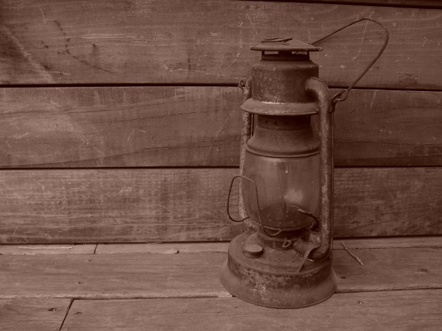
Good composition. The monochrome color gives the picture a beautiful rustic look. A bit more contrast would give the shot more depth of field and the lantern would really pop out of the scene. Blurring the wall behind it just a tiny bit would also work.
Not sure what 'windmill' has to do with this image (unless this was taken AT a windmill). I do like the lighting and tones. Lantern is a nice subject and the fact it is not dead center is nice. Good luck!
my first impression when looking at this photo is not 'windmill'. However, it does look like something from the past. I do really like the tones, and the pink overcast works for this shot in my opinion. The angle and framing/cropping at first, I thought were a little off, but I actually like the slight left tilt of the strong horizontal lines in this. And I also like how the lamp is not dead center, but slightly off centered. Focus and clarity are also really good. Overall a wonderful shot. ~Heather~
Not sure how the title fits the photograph? Good shot but it lacks a bit of contrast, although I understand there is little you could do about that, because of the no editing rules.
Windmill? At any rate, good subject matter for the past, but I think it would have been a vast improvement to shoot this picture at an angle and to have the lines of the porch fade off into some sense of distance. Basically, it feels rather flat.






 Add photograph to your favorites
 Add photographer to your favorites

 Photographer found comment helpful.


