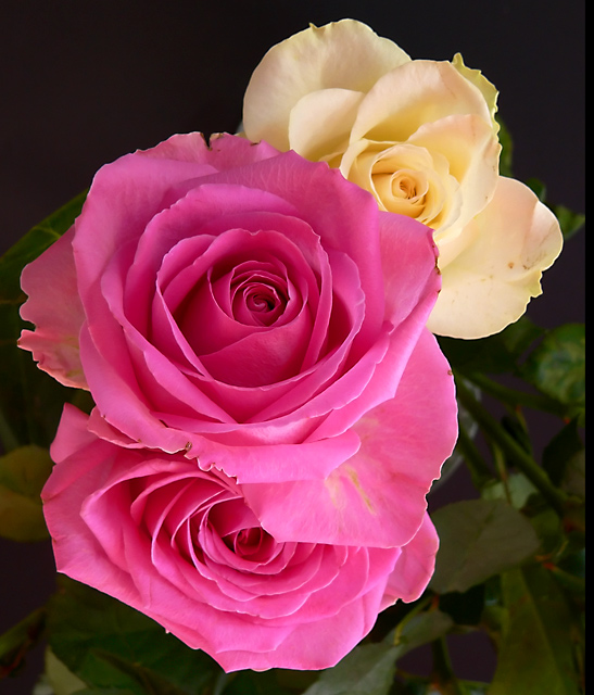
Not much to say other than it struck me that year on year we see the blooming of flowers and plants and that this is a tribute to the successful design and evolution of nature. Being roses adding the notion of smell seemed obvious.
PP:
- noise ninja
- crop
- hue and saturation
- levels
- sized
- saved for web
Statistics
Place: 81 out of 184 Avg (all users): 5.2978 Avg (commenters): 6.3333 Avg (participants): 4.8364 Avg (non-participants): 5.4471 Views since voting: 1106 Views during voting: 293 Votes: 225 Comments: 6 Favorites: 1 (view)
Camera Work/Technical: Fantastic exposure (read perfect) and one of the best depth of field uses I have seen in a while. Every piece of each flower is in crisp focus, while the background blurs quickly and very nicely. Great white balance to produce very appealing colors.
Lighting: I'd say even and flawless. I read the doc's comment, and I cannot seem to find the area that is overexposed. I think that the lighting is wonderfully even and no detail was lost in any part of the image. I also think that the coloring is spot on. I am looking at it on a True Color notebook that was calibrated last week, and it looks dead on.
Composition/Content: I do agree with the good doctor on the composition. It is a little tight, and backing out just a hair would give the eye some room to roam in the frame.
My Opinion: While you have an image that is technically beautiful, it would be hard for the voter to see success without reading your description, even with the title. Great coloring and very well seen. I think that this one would have pushed the top ten for some other challenge.
Two suggestions off the top of my head.
1) The close crop, while helping us see detail, doesn't help the composition. Because of it, the roses seem quite centered and static. Zooming back a bit so you can have some negative space on one side may help.
2) The lighting is a bit harsh. Look at the lower right petal of the middle rose. It is quite bleached out. I'm guessing you used a flash. Sometimes something as simple as covering the flash with a kleenex will help.
3) Watch reds in digital photography. They saturate very quickly. I see you did hue/saturation and I'm guessing you bumped everything like we all do. It is becoming more frequent that I actually desaturate reds because of how they can look. I pulled the pic into PS and tried it and do think it looks better. Adjust the reds to -30 on sat and also +30 on hue. Tell me if you like it better.







 Add photograph to your favorites
 Add photographer to your favorites

 Photographer found comment helpful.


