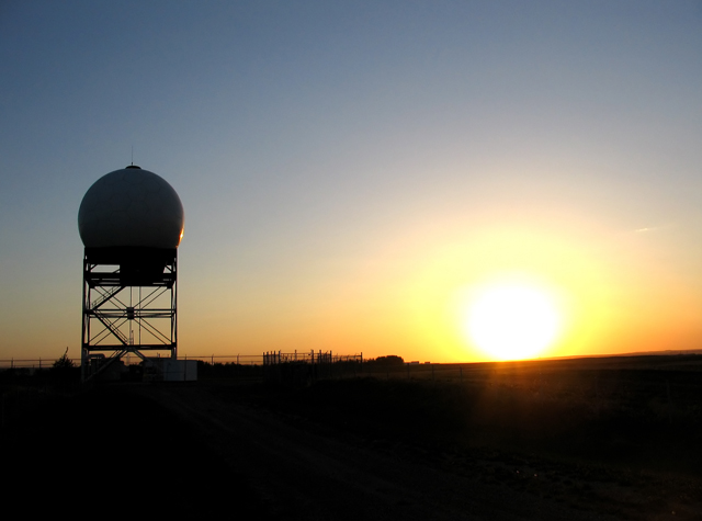
One thing I find is that you either want detail to your subject (the tower) or you want complete sillouette. If you drag the photo into PS, you see the tone is about a 29 on a range of 0 to 255 (0=black, 255=white). Use levels and increase the low number to about 30. This will give the tower a true black (almost) and you can see it looks better.
Next, for heat, the blue in the sky hurts. It doesn't mean it isn't nice for an ordinary picture, but in the context of "heat" it cools things down. Take your picture again in PS and adjust the color balance to +100/0/-100 (a bit extreme, but to prove a point). This will turn all that nice blue to a orangy brown. Now it looks like we need a glass of water. Before I actually thought of a cold winter prairie sunset. |






 Add photograph to your favorites
 Add photographer to your favorites

 Photographer found comment helpful.


