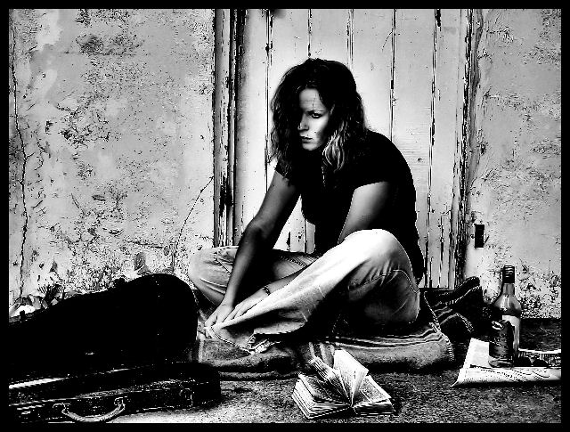
Another one of me >.> My lil sister wouldnt pose for me
Cropped
Brightness/contrast
Black and white
Brightness contrast
Sharpened
Resized (Wrecked it made it all pixelated)
Statistics
Place: 9 out of 129 Avg (all users): 6.3744 Avg (commenters): 6.9375 Avg (participants): 6.0816 Avg (non-participants): 6.4551 Views since voting: 5014 Views during voting: 557 Votes: 227 Comments: 31 Favorites: 7 (view)
Wonderful for the challenge and able to stand on its own quite well also. Gritty, well photographed pose. Perhaps a bit set up feeling, but gets the idea across. I think the b/w here is perfect.
First Impression - the most important one: Top ten .. congrats, well done and all that ... now a few comments. first impression is this is gritty and realistic.
Composition: I really like this and feel that you have worked things through to bring the best from this shot.
Subject: You met the challenge and did so extremely well.
Technical (Colour and light): This is the issues part. I think that a little less post processing and use of neat image and you would have really challenged for the blue. That is the only issue with this picture and i think that would have lost you minor but valuable points.
To grow its vote?: As above ... but really you did fantastic.
Summary: Great job, congrats.
If you've got any questions about this critique, please feel free to contact me via
the PM system.
I definitely like the shot and the style you are using here. The only thing that i find somewhat distracting in this photo, is that the face may have been over done in post processing. Im pretty new to all this myself, but my guess is too much burning? Also, the outline of the jeans and the arm against the black background (shirt) jump out. Other than that, this is an amazing photo. Keep up the good work, and yeah.. I like your style here!
A great attempt to create a mood, but it seems the post processing may have been overdone. This could have been a great image, but now seems rather average.
Don't give up the ship... you definitely have talent.
Great capture, but a bit over-precessed. It looks like neat image, and you lost some of her face detail with too much of it. Also, I'd like to see her shifted away from the center a bit.
This image says failure without the title, good texture and expression, has been over sharpened ( halos around body) before noise removal, but in a way this all adds to this image, in a strange way....10
this could have been a winner if it weren't for the post-processing. There are sharp haloing lines around parts of the body and the skin looks to have been smoothed too much resulting in a lack of details. I like the mood that this generates still. The emotiveness tells me a story. You may still do well, I just think your score will suffer some from the flaws in pp. (8)






 Add photograph to your favorites
 Add photographer to your favorites

 Photographer found comment helpful.


