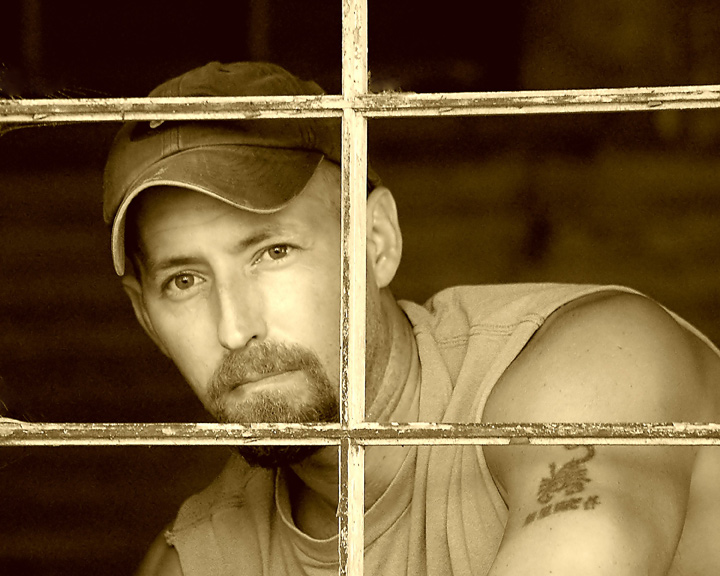
Me looking out of an old window in the barn behind our house. I had to stand on a bucket. I set the self timer on 20sec. I focused on the frame of the window, hit the shutter, then ran over and stood on the bucket.
---------------------------
A big thanks to everyone for all the nice comments. Thank you all very much.
--Stephen
Statistics
Place: 30 out of 236 Avg (all users): 6.5341 Avg (commenters): 7.4643 Avg (participants): 6.3407 Avg (non-participants): 6.7153 Views since voting: 2326 Views during voting: 474 Votes: 279 Comments: 38 Favorites: 3 (view)
Greetings from the Critique Club. My critiques are generally geared towards trying to help you improve your score within DPC, and not on any true "artistic" merit of the photograph itself, unless it relates to DPC voters and scoring. Please keep that in mind as you read this.
Initial Thoughts A good shot, but not so much on the choice of sepia, for me.
Composition/Content Very nice compositionally. The criss-crossing window pane works very well (although the slight off-plane is a bit distracting). I like where you are positioned, but could have worked with you being a little higher as well.
Background Nice shallow DOF, no distracting elements. A little noisy, which probably hurt you slightly with voters.
Camera Work/Technical Exposure of some highlights are a little blown. Whether this is in post-processing or not, I don't know, but it is especially noticeable on your cheek, under your left eye. (viewers right). Distracting to me. A little healing brush, or low-opacity burning could have helped that. It's about my only real critical mark.
Digital Processing Now, this is purely my own taste, but the sepia toning you've used here doesn't really help the photo, I feel. It's just a little too light and yellow, and speaks of photos from old, old newspapers.. yet you have more of a modern look to yourself which would have been better served, IMO, with a deeper sepia. Something suggestive of warmth and a more modern look. Yes, I know that your score suggests that people liked it this way, but for me it just doesn't work, clashes just a little too much. Also, it lacks a touch of contrast to really bring out the blacks and give the image a touch more punch.
Fits the Challenge Unless it's not you, it fits.
My Opinion of the Photo I suppose I should have left what I said in processing for here, but it stands both ways. I honestly do believe with a different sepia look, you could have been staring at a high 6. As it is, you have a score anyone would be proud of.. so you did something right regardless of my own tastes. A well done photo, and good luck on future challenges.
There is something restful about this image. Hmmm, maybe comforting is a better word. Not sure if its the expression or the tones used. I like both though. 8
I really like the looks of this one. To nitpick, the tone is a bit too saturated for my tastes, and the eyes seem just a bit softer in focus than I would like. The composition and lighting are great.
Nice sepia tone shot; the window gives you protection; but it also lends a certain vulnerability; I distracts from you face; but also frames it. Nice softer focus too.
This is one of my favorit of the bunch. I believe I really get a sence of who you are..... The focus Is perfect and the catch lights in your eyes really bring them to life. Great job. 9
I like where you positioned yourself in this portrait...it adds character to your image having the window between you and the camera..sort of puts you where you are comfortable..good work.
Nice. A touch harsh on the lighting on the nose and right cheek, but the composition is good. I sense that the focus is on the X of the frame and not your eyes. Perhaps that was the intent - thus the title. No detractions for that.






 Add photograph to your favorites
 Add photographer to your favorites

 Photographer found comment helpful.


