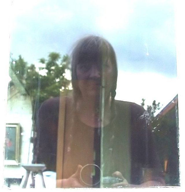
nice mix of indoor and outdoor. the muted colors and "unsharpness" set a mood. I'll meet you at the bottom of the scores pile! but personally, I'm giving you a 7.
reminds me of a photo Imogen Cunningham did in a store window. except she was a little old lady when she did it... [url=www.geh.org/fm/cunningham/ m197928880001.jpg]Self Portrait on Geary Street.[/url]
I don't believe it, Titia! Interesting concept. I think for what it is, it's sharp enough. I would like to see the colors bumped up with a bit more depth. I like your use of the edge (risky here, but I LIKE IT!)
Sorry but the horrible image quality is the hugest drawback with this image, hard to give it a good score. Just too washed out and flat and no details to speak of. No offense intended of course, just wanted to explain the low rating I gave you.







 Add photograph to your favorites
 Add photographer to your favorites


 Photographer found comment helpful.


