Greetings from the Critique Club. My critiques are generally geared towards trying to help you improve your score within DPC, and not on any true "artistic" merit of the photograph itself, unless it relates to DPC voters and scoring. Please keep that in mind as you read this.
Initial Thoughts Great look, not too big on the coloring though.
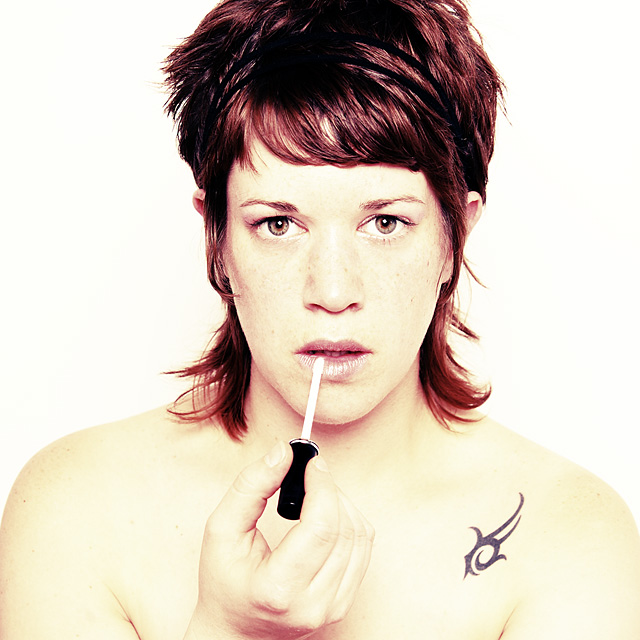
Composition/Content Compositionally, this is very good. You've made good use of the "thirds", you don't crowd the frame, and everything has a nice flow to it. The added action of putting on lip gloss gives this that extra touch that many usual portraits of this nature tend to lack too.
Background A nice white background that is only just slightly over-exposed down near the shoulders.. or at least, the background isn't over-exposed, the shoulders are, and kind of run into the background slight. Makes me a little squinty.
Camera Work/Technical While the first thing I'll mention is that the subject itself is over-exposed, it also has that *intentional* feel, and works well enough in this instance. Voters also picked up on that I see, by your score, so it was a good choice, if a little brave. I suspect some voters also gave you lower marks for it as well.. one of those "art over technicals" that sometimes gets pulled off for the better. Job well done. I, personally, would have preferred it slightly less exposed, but to each their own. Focus is dead on though, and the eyes look fantastic.
Digital Processing The yellow coloring of the skin, while classic for the acid filter, doesn't really work for *me*. I wonder, if it was a little more naturally toned, if this wouldn't have grabbed a few higher votes as well, and maybe bumped you up even further? Speculation though, so I'll not pursue it further. What I like is the toning of the hair. That is brilliant.
Fits the Challenge Unless this isn't you, it definitely fits.
My Opinion of the Photo While I know that this kind of "surrealistic" look is growing ever more popular on DPC, I myself prefer more naturally toned portraits. While I love the hair and eyes, the skin really turns me off a bit, and I suspect did the same for some voters as well. Still, it all comes down to taste, and you obviously appealed to more voters than you didn't, and a 6.3+ is a great score. I just think, with a more naturally toned photo (especially skin tones), and less blown highlights, you might have been able to hit high 6s. Nonetheless, good job, and good luck on future challenges.
Plain white backgrounds always get me excited for some reason! Good choice there! Fantastic connection with eye-contact as well! Great portriat overall!
I like the color and you've got good detail. The tattoo is a bit distracting to me. The expression lacks something, not sure. I watch my wife put that stuff on her lips and she makes all kinds of lip stretching contortions. Might have helped?
You have a very expressive face Biteme (I recognize you from other challenges) and I like your style in photography and creativity. I gave you a 9, which is the highest score I give and that's not because you're Dutch too. I never give 10's because I like to think that nobody's perfect.
Well hello there :P Hey I didn't know you had a tatoo ;) Great image overall. My only thought is that you cut off part of your head so that's a little distracting. Other than that, it's a nicely saturated image. Well, if you don't like my vite, well then - biteme! :P
HeY Han, Mooie tatoo heb je!! Ik verwachte eigenlijk een ander soort lichaamsversiering, iets met een S erin en zo, haha. Mooi sereen portret, en eh, Han's Favo filter! Aciiiiiiiid! Mooi gedaan!





 Add photograph to your favorites
 Add photographer to your favorites

 Photographer found comment helpful.


