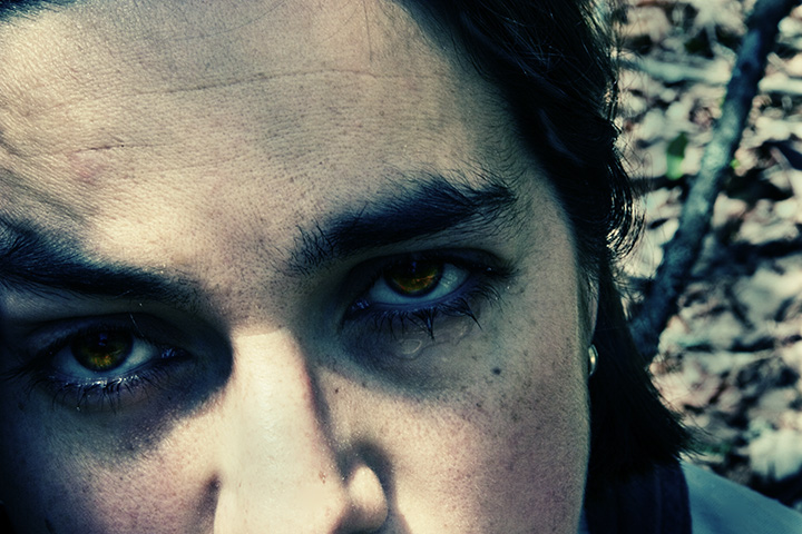
it's been a hard few weeks. sometimes i just need to go off into the woods for a good cry.
Photoshopping: (in no particualr order, as i forgot to write it down as i went)
usm
spot heal
acidify action
dodge
burn
sponge - saturate
sponge - desaturate
Statistics
Place: 170 out of 236 Avg (all users): 5.4892 Avg (commenters): 7.3750 Avg (participants): 5.4496 Avg (non-participants): 5.5235 Views since voting: 897 Views during voting: 393 Votes: 278 Comments: 10 Favorites: 1 (view)
Greetings from the Critique Club. My critiques are generally geared towards trying to help you improve your score within DPC, and not on any true "artistic" merit of the photograph itself, unless it relates to DPC voters and scoring. Please keep that in mind as you read this.
Initial Thoughts Very emotive, a good strong image, but probably a little too artistic for DPC.
Composition/Content You've taken a different route compositionally with this one, as close-ups of this nature are rarely done in landscape orientation (at least in my experience). Usually square or portrait cropped. I feel that, because of this, the amount of forehead you've left takes too much from the focus of your photo, the eyes, and there's too much space left to wander to. An even tighter crop, giving us a much more elongated photo, with less forehead, could have really pushed those eyes at us, and grabbed the attention needed.
Background What background there is, is nicely done. good shallow DOF, and plays well. The chaos works with the tender sadness of the eyes. I doubt that many voters would catch such a thing though, but even for them, I doubt that it detracted from the photo.
Camera Work/Technical f/22 and you still had an OOF background? Crazy, was this using a macro lens? Also, for 1/13th, I see no visible motion blur or anything, so good on you for being so still. Your eyes are wonderfully in focus, and I imagine that was a very hard thing to do.
Digital Processing Now, while I know that this look is becoming more and more common and well-recieved on DPC, It's not a look that I really like for portraiture tha much. (the acid filter look). I prefer a more naturally colored portrait. However, because of the emotive qualities you've given, I think it was a good choice to use... which is rare for me to say. Still, I suspect that it is one of the reasons that lower scores were given out.. but probably not as big a reason as the cropping choice. The work on your eyes is beautiful, however. Great job there.
Fits the Challenge Unless it's not you, it definitely fits the challege.
My Opinion of the Photo A strong emotive shot that is a rarity on DPC. It's nice to see, even with the lower score, and I'm glad people still *want* to do this type of shot. Like I said though, I'd have preferred to see a different crop on this, isolating the eyes, and giving us less to wander off to.
Overall, a great shot, but just not DPC strong. Lacks too many elements that voters want, and *negative* emotion never tends to do well outside specific challenges.
CTCP2 Gunnsi First impression: Beautiful sad eyes.
Good focus, nice contrast, good use of natural light and beautiful colours in your eyes.
What could be better?
I would have preferred to see more of your lovely face.
I will pray for you to see the world in a better light.





 Add photograph to your favorites
 Add photographer to your favorites


 Photographer found comment helpful.


