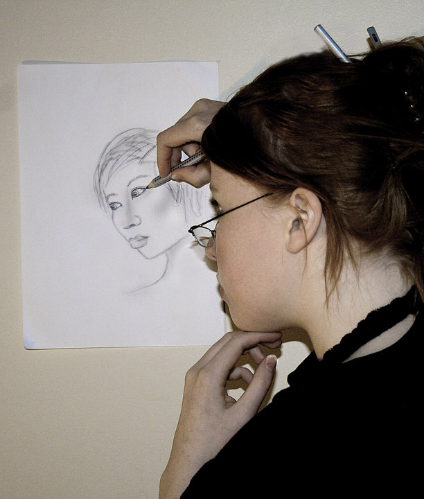
The setup was a bit complex on this one :) ironing board with all my harry potter books on top :) I drew the photo just for the challenge, and yes i know it looks nothing like me. Think I better stick with photography at least for now.. my drawing skills aren't all that good :P
Minimum prosessing going on here, levels, hue/saturation, bit burning in the drawing and croping in the end.
Don't know how you all will like this.. I think its kind of cool :)
Statistics
Place: 141 out of 236 Avg (all users): 5.6525 Avg (commenters): 6.2667 Avg (participants): 5.4328 Avg (non-participants): 5.8514 Views since voting: 1339 Views during voting: 499 Votes: 282 Comments: 21 Favorites: 0
i gave you a seven apparently but the weirdest thing about this for me is the blue hands. like zombie hands. lol. not sure if thats lighting or just from holding that pose too long but its off putting.
I'll have to agree with the others that say that the biggest downfall on this shot would be the harsh shadows. Getting lighting right is tricky, but really helps to separate professional shots from more snapshot-ish ones.
The composition on this one seems a little off to me also, with things divided nearly exactly in half vertically. I like the idea of the shot, but I would have enjoyed seeing more of your face in it.
And like others have mentioned, a 5.6 is nothing to sneeze at!
I think your score reflects the fact that the image has technical problems, but is a great idea. If the idea were executed with just a little more care, the impact would have been greater. Just as an example, you can see the strong, hard shadow cast by the flash. The lighting is a bit flat in the image, which lessens its interest. Your position in the frame isn't the best choice, in my opinion. However, the idea is basically good, and a few adjustments could improve such a shot. (Your score of 5.653 isn't too bad!)
I think the big thing that hurt you is there are too many distractions in this image for me. The hair pins for one. The shadow also. It is an ok image with great potential. You have a really creative idea whihc can be greatly improved. My advice to you is to reshoot this with better lighting.
I thought when I saw this one that it was a Krisby. ;)
Your lighting is getting better althought the sharp shadow behind the left hand and the high contrast of the right hand with the paper point to a little more work there. Love the work.
Really great idea! Wish you could have had more of an easil type set up to get more of an artsy feeling ( easil- did i spell that right?) Anyway, Something that we could see your great work, and face! From what i see, You would have looked great in a simple full face portrait, and with advanced editing, you could have gone any way with it. Nice job tho
Interesting take. Two thing bother me -- the shadow under your chin, and your left hand looks a little blue to me. Maybe my monitor, maybe warm it up a bit using a white balance adjustment?
Wow, same idea as mine. Obviously I really like this idea. You're hand has a bluish tone that doesn't look right. There's also a lot of empty space that's not useful in the image. A tighter crop would've worked better in my opinion.






 Add photograph to your favorites
 Add photographer to your favorites

 Photographer found comment helpful.


