Author Thread
Post actions
Thank you all for your comments. I appreciate your opinions and willingness to share them.
Comments Made During the Challenge
Post actions
The other poker one was better executed.
Post actions
another poker fan, awesome! 7 from me
Post actions
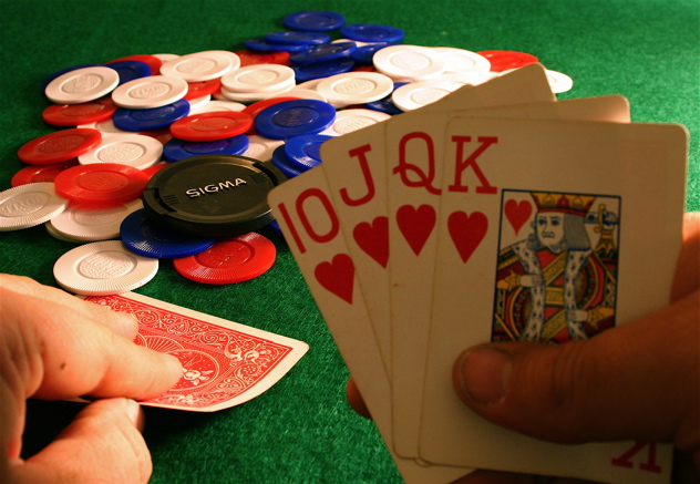
Only nit here is need a bit better lighting on the card faces. Good DOF.
Post actions
One of my favorites for this challenge. I predict a top 10 finish. Well done!
Post actions
good idea. the light is a litte dark on the hand of cards. I realize the subject is the lenscap, but the eye is still drawn to the foreground.
Post actions
Great shot. Like the concept. Good job.
Post actions
a little hot on the far chips
Post actions
... and a three of clubs. If this was my hand.
Post actions
Would be nice if the faces of the cards were a little brighter, but I like how you fit the lens cap into the picture.
Post actions
Nice parody and a good pic overall, but I think a bit more light on the cards would be helpful.
Post actions
Nice but the whole shot has a very distinctive red cast over it, I would have preferred this shot with a cooler white balance.
Post actions
Post actions
nice job, I like how you chose to leave the player's hand of cards not lit to give the photo that sense of secrecy
Post actions
I would never bet a lens unless that card was an ace of hearts!
Post actions
Bad lighting on the cards. It takes away from the rest of the picture.





 Add photograph to your favorites
 Add photographer to your favorites


 Photographer found comment helpful.


