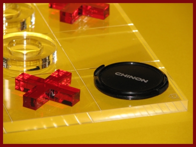
I think this was a clever idea, especially considering the creative difficulties presented by the challenge. The composition itself is alright, but much too yellow. Somehow the colors look a bit dull and the edges of the game pieces look too soft. Not sure what to suggest for improvement on this one, perhaps more diffuse lighting?
First Impression: Nice idea with a strange name on the lens cap (I've never listened of it).
Composition: Correct.
Subject: Maybe a bit difficult to understand. That game is not very popular in my place. But the idea is very clever.
Technical: It's a bit dark overall, it doesn't stand out for the colors. The exposition is a bit underexposed for my taste. Focus is very good.
Improvement: Make a brighter image.
Technicals: The lighting didn't come out well but you did do a good job of minimizing the hot spots. As for the color it looks a bit dull to me. Maybe some photoshoping with the levels could have helped that a bit.
Subject/composition: Good idea for the subject. However, it wasn't immediatley obvious to me due to the crop and the translucent board. I think this might have been one of those occassions where a view from the top would have been better.
Suggestions for Improvement: Hard to provide much here really. Honestly I think I would have just shot something else with more features rather than those translucent elements which seem like a nightmare to light. However, if you are going to shoot that try that above angle that I mentioned earlier. If anything it would make the idea easier to see in the image.
I think it might have been better if you'd shown us more of (what I can only deduce must be) the tic-tac-toe board. It's a nice idea, but it could have been better executed.
The subject is clear: a lens cap. The composition is good, I like that table of old woman game (as we call it literally here). The issue here is focus and light. This is not a challenging situation to focus. May be you had shot it handheld in low ligh and get a sort of camera shake. Then a tripod or standing was helped a lot. The light is a matter of taste, it´s to harsh, revealing to many hot spots and glares. Yes, reflective surfaces are challenging.
only if the other corner is an O! I like the composition and the clear game pieces in this photo, good job controlling glare, only thing is maybe a little sharpening could help this photo, but nice work





 Add photograph to your favorites
 Add photographer to your favorites

 Photographer found comment helpful.


