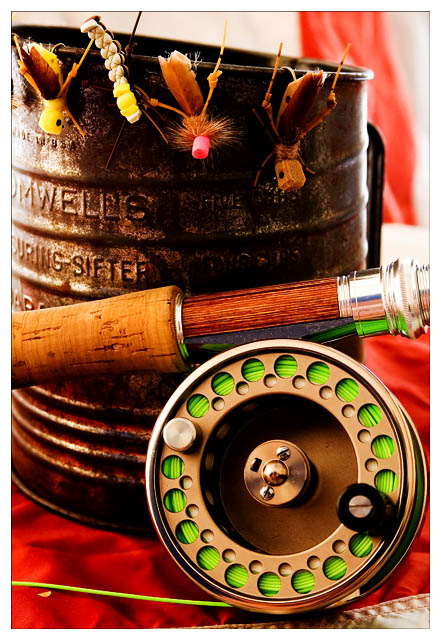
My fly-fishing gear shot in my home studio with natural lighting. Background is a very large, American flag. The sifter is a bit out of place, but I think that it fits the composition nicely.
Here is what it SHOULD look like.
Statistics
Place: 9 out of 338 Avg (all users): 6.4935 Avg (commenters): 7.8462 Avg (participants): 6.3474 Avg (non-participants): 6.5956 Views since voting: 2217 Views during voting: 315 Votes: 231 Comments: 29 Favorites: 3 (view)
I'm really sorry, I must have overlooked yours when I commented on Still Life.
This definitely deserves the top 10 place it received, its very crisp and well-lit, and fits the challenge very well - it keeps to the traditional style of still life but with more original content then fruit and wine (eg).
The red b/g complements the green perfectly, and this contrast makes the colours pop. I like the composition, with the reel in the bottom right and the bait/float thingies (you can tell I don't fish!) in the top left, but I'm not entirely sure about the positioning of the rod in the middle - it looks a bit awkward and central, but I'm not sure where it would be better.
Lighting is very good, but I'd like to see a bit more light (or dodging if advanced ed) around the right-most two floats.
Other than that, there's not much I can say except congrats on the top ten, and new image on your profile page.
great still life, composition, color and lightins is very good, but the small piece of white cloth in the lower right corner is a bit destracting, I think the image would have been stronger without it.
Congrats on another top 10. I gaveyou an 8 on this one. Loved the colors and composition. Good twist to see something other than fruit and flowers. Well done.
Trading Post comment
Top 10! Very nice finish. I rather like the sifter - in fact, that makes the image for me. A nice, tight composition with an interesting color scheme; lighting is excellent for this shot. I'm pleased to see this did well even though it's not flowers or fruit. Good job, and congrats on the excellent finish!
Trading post...
Top 10 again! Woohoo! Dude, you're hot. I gave this a 10 in voting. I loved the colors and composition. The lighting is fantastic. Since I gave you a 10 I didn't see anything that could be improved.
Congratulations on high score and top 10 placing. The colors and texture is amazing. The subject is different which makes it interesting. The focus is shart but I feel that deeper depth of field might have helped a bit. The extrement left side of the photo seems to be soft-focussed. The is slight over-exposure (or is it glow filter?) visible at highlights (right edge of drum and highlights on metal). These are just minor things I struggled to find out to give my comments. Overall a good composition which stands out for being different (in terms of choice of subject).
Why is this posted on your website? Isn't that kinda illegal? You posted a comment on the message board about this challenge and linked your website....isn't that kinda against the rules??






 Add photograph to your favorites
 Add photographer to your favorites


 Photographer found comment helpful.


