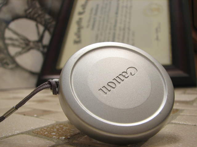
This was done as a last minute entry into the Lens Cap contest. I didn\\\'t have much light to work with, but the bathroom has the most lighting for the most space. To add to the photo I put a few key items behind it, but out of focus (one being my college diploma and they other some art work that was on my wall. The close up gave a sharp photo of the lens cap and made it the most prominent subject in the photo. The only editing I did was very minor brightness/contrast adjustment.
Statistics
Place: 99 out of 183 Avg (all users): 5.3123 Avg (commenters): 6.5625 Avg (participants): 5.0633 Avg (non-participants): 5.3950 Views since voting: 937 Views during voting: 462 Votes: 317 Comments: 17 Favorites: 0
Since you've asked for comments:-)
This is a 5 shot for me. Technically good, lighting and exposure are on the spot. DOF is what you wanted, but the background is a bit too blurry - I would have preferred to have it more legible so that I can have some context. It's a diploma of some sorts, but what is its relevance to the scene?
Also, the cap is tilted - almost levitating. It is in a very unnatural position, and there is no trace of any motion (I would have preferred to see the prop or to have the traces of motion in the image, but that's just me.)
Moreover, the overall tone of the image is gray-ish. Lenscaps are not the most interesting nor the most colorful objects to take pictures of, so you could have used some livelier color to boost the photo's dynamics.
oh man, your lens cap sure does have an ego, better than da vinci?... lol.... good DOF, maybe a solid floor would have helped your photo, but I really like the colors and the smooth focus





 Add photograph to your favorites
 Add photographer to your favorites


