Author Thread
Post actions
Congrats on top 20, but this is a great shot should of been top 3 well done!
Post actions
Ok you were robbed. This was in my top 3.
Comments Made During the Challenge
Post actions
It looks too dark for my taste; although I am aware that if it were more brightly lit that I might then say "too bright." I don't know.
Post actions
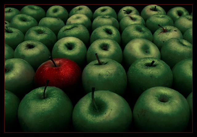
Nice use of color to create a good shot. The colors look a little unusual and the light very muted, but it happens to work well with this particular shot.
Post actions
looks a bit dull but nice contrasting colours
Post actions
This is a very cool idea. Good choice on the green & red and framing but I so want it all to be brighter. Cool shot.
Post actions
Very nice.. Simple but sweet.. one of the best in the comp -- 10
Post actions
Great shot. Only thing I can think to suggest would be a little more "uniformity" in the green apples (not all have stems). Bumping
Post actions
Perfect photo, top ten for sure. The almost black and white low saturation makes the colour contrasts in this excellent. The moisture on the apples also brings this photo somewhat alive. Really well done, 10
Post actions
This meets the challenge – it’s inanimate and arranged. Too dark too colour saturated.
Post actions
Post actions
Post actions
The one thing I may have done is crop it right where the red boarder is at. I think is a wonderful photo. I love the lines, color and contrast.
Post actions
I like it. I would have liked to see the red one a bit brighter so it stood out more but that's about it. 8.
Post actions
Post actions
Is this selective editing? Just curious.
Post actions
beautiful, the lighting is amazing, how did you do that?
Post actions
idea is not new, but still effective. Picture is abit on the dark side and greens look unnatural
Post actions
Post actions
nice, but the exposure looks a little on the dark side, so the colour doesn't really pop
Post actions
Really great shot and I now love the DOF. I think the colours are perfect and the lighting really adds to the shot. Love you :) 10






 Add photograph to your favorites
 Add photographer to your favorites

 Photographer found comment helpful.


