Author Thread
Post actions
i really like the dark tones of this. nice photo!
Post actions
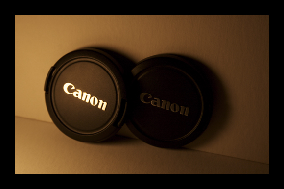
This was too subtle to capture during the challenge. But in retrospect, I think it is very well captured and presented.
Comments Made During the Challenge
Post actions
Yessssssss.. love it... !
Post actions
the black border is awesome with this picture, good one
Post actions
Nice setup.
Post actions
I like the angle and the muted background. Maybe have the cover with the name lit overlap more of the one that's in darkness. Border is a bit heavy for the picture.
Post actions
shadowed by its brother. Good light
Post actions
Awesome shot. i actually thought that the lens in behind was a shadow, until I realised that there was writing on it, too.
Post actions
I love the lighting in this photo! Great job!
Post actions
Why the dim, unflattering lighting? Sibling on right can hardly be seen.
Post actions
I can't even really make out the second one...
Post actions
hmm... looks like real siblings to me, one getting more attention than the other.. lol... I like the softness and the color of your photo, nice job, the border is also a nice finishing touch
Post actions
The second cap is too dark, border is also too wide for my taste





 Add photograph to your favorites
 Add photographer to your favorites

 Photographer found comment helpful.


