First Impression Nice shot with very good DOF.
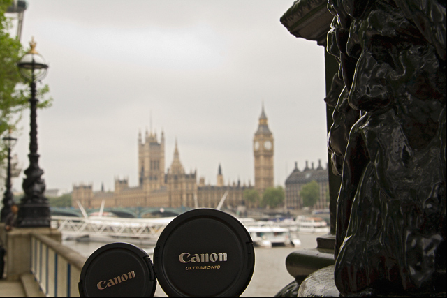
Composition: Good Composition. The "son" is cut. Don't know if it was possible to keep complete round of both lense caps.
Subject: It was very tricky challenge. I actually could not think of any idea for this one. So nice take on the challenge.
Technical (Colour and light): Good DOF and colors. I would prefer more lights on the BG, particularly to bring out the beautiful building.
Improvement: More lights on the BG and full lense caps.
Summary: Nice over all shot, and deserves better score than what it got.
Very cute idea! The focus and lighting is good on this. The biggest improvement I could suggest would be to crop in tigher so that the two lenscaps fill the frame more, with just some of Big Ben the tower (big ben?? don't know my London sights that well) in the bg. The dark 'thing' at the right is too distracting and doesn't really add anything to the photo.
Great job... this one was fun to look at and a great idea.
Oi! from the CTP MkII. I shall not be going with the usual format as it feels cold and impersonal, IMO.
The shot's mildly amusing, in a british sort of way. Subject abounds with dry humour, and for just that I believe it should've placed higher. Yeah.
I guess there should be more lenscaps and less London, though. I mean, father and son and just Big Ben on the bg would've maaade your shot.
Congrats on integrating "cute" and "London" in one photo. Yeah.
CTCP2 Gunnsi First impression: Funny :-)
Pros:
Good focus in the near, nice background.
Cons:
1. I would have liked to see a bit more of the lenscaps. The artwork in the right takes a bit to much room.
2. The picture needs a bit rotation.
This is an adorable idea. The composition is alright, though I'd like to see more of a color pop since the color seems a bit dull. I'm honestly not sure what to improve upon otherwise, this was such a strange challenge topic to judge.
I think this is a cute shot with a lot of potential. The exposure and focus is nice and well done. What takes away from this shot, IMHO, is that is it overly busy. The statue in the foreground and even the light pole in the background seems to be competing for the focal point. The sky is a bit washed out but it's rainy London so I'm sure there's not much to do about that. I wonder what this shot would have looked like at night or approaching dawn.
Hope this helps a bit.
Peace
Rooster
Technicals: The lighting is ok but I think I might have liked a bit more on the lens cap to make the lettering stand out more or something else to add some wow factor to this.
Subject/composition: Nice idea for the subject. Composition-wise, I wish that sculpture thing wasn't there but otherwise it works fine.
Suggestions for Improvement: I think you carried off the idea well but it lacked that something extra. Maybe have the "daddy" lens cap tilted more so that lighting from the right could rake over it creating an interesting gradient.
cute, good focus, nice background, maybe if the statue/carving on the right weren't in the picture that would help, good DOF and smooth picture, nice work






 Add photograph to your favorites
 Add photographer to your favorites

 Photographer found comment helpful.


