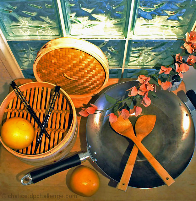
I really like the arrangement of the still life, with the chopsticks echoing the shape of the wooden utensils, and the composition of the different circles together. I'm not sure about the flowers - they fit contextually, but the rest is very geometric and they don't seem to fit anywhere particularly.
I'm not sure about the window being there - it seems to contrast a little too much with the rest - its very cool in colour, compared with the warmer tones of the foreground, and I think this makes it look as though the wb is off overall.
Lighting is good, its lit well enough but still remains subtle.
I think this would have been better had you kept the same basic arrangement, but placed it somewhere without busy surroundings like the window, and either skipped the flowers or incorparted them into the composition more.
i gave this one high marks. i really liked it. thought it worked well with the challenge. i liked how the props were assembled. it all seemed to make sense. i like the lighting and the angle of view. i really thought this was a well thought out and well executed photo.
my gripes are just the minor white balance issues and a bit of a burn out on the bamboo. not really any major problems that i can see. should have done way better in my opinion.
Trading Post -
I gave a 5 on this shot. You definitley met the challenge and it was niec to see some different props and a different take on the challenge. But overall the shot just didnt work for me. The crop seems a bit weird with the steamer being cut off. The colors are a bit too orange and the glass bricks are ditsracting - they dont really ad dmuch. I think what would have been nice is seeing these items arranged on a solid piece of red fabric or something to allow them to stand out better without haveing to deal with the bricks or the table underneath. A good idea to start with - better execution would have scored you much higher.
Trading Post comment
This is a very novel approach on a still life - I like the choice of a differet angle! I like the orange tones balanced by the slight green of the block windows, and the two X's formed by the utensils balanced by the O's of the pan and steamer. A well-thought out design. I think I'd have preferred it arranged such that you didn't have the window frame on the left - it's nicely disguised on the right.
--Trading Post--
You came up with a very nice composition and layout for this shot. You chose interesting subject matter and it all is nicely focused. There appears to be a slight red hue over the entire image, kind of like the WB is off. Also, it feels just a little cramped with the left edge of the bowl missing and the right edge of the wok touching the border.
Trading post...
I thought this was a great shot. I gave it a 7 in voting. The colors and arrangement are fantastic. What I wasn't crazy about was the perspective. I think this would have done better at a lower angle. The top row of windows is very distracting.
This meets the challenge – it’s inanimate and arranged. The composition on the table is nice, but there's too much extraneous stuff getting into the picture.
This is another one that I'm wondering why the flowers are in the picture in the way that they are. Are you planning on cooking them? However, the color of the flowers are pleasing to look at. I would have given a 10, but because I'm confused about the purpose of the flowers, I give a 9.





 Add photograph to your favorites
 Add photographer to your favorites

 Photographer found comment helpful.


