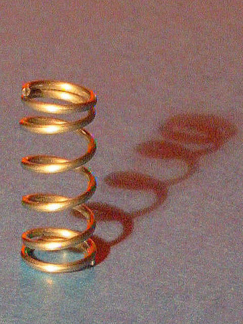
The idea is amusing but the execution is pretty bad. The shot is grainy. Sometimes noise adds to a photo, but in this case I don't see it adding anything.
No points for meeting the challenge with a non-season sense of spring, but I like your composition with the spring and its interesting shadow, and you've left enough space around it to keep it from being cramped. There is some sort of pixelation, but it doesn't look like the oversampling or compression artifacts so common in digital photos, and I kind of like the effect it gives to this image. I think it makes the photo a lot more interesting than just a sharp spring on a polished granite surface. Was it intentional? It is a bit distracting, perhaps slightly overdone, but it's hard to say. It looks great viewed a few feet back.
I really like the noise and lighting in this shot, as well as, the soft focus and compositioin. Simple, but very effective abstract. I like the pastel effect of the background and the way the color graduates between a bluish purple on bottom and reddish orange on top. I find this to be a very artsy picture. However, I don't believe that a play on words here meets the challenge requirements, and I also think a border would have been appropriate.
I love the thought put behind this photo, but there is a problem. I don't know if it's just my computer or what, but this is a very grainy photo. The only other thing I see is the glare from the light.







 Add photograph to your favorites
 Add photographer to your favorites


