Greetings from the Critique Club. My critiques are generally geared towards trying to help you improve your score within DPC, and not on any true "artistic" merit of the photograph itself, unless it relates to DPC voters and scoring. Please keep that in mind as you read this.
Initial Thoughts Hmmm.. not sure I'm going to be able to say much to help you :)
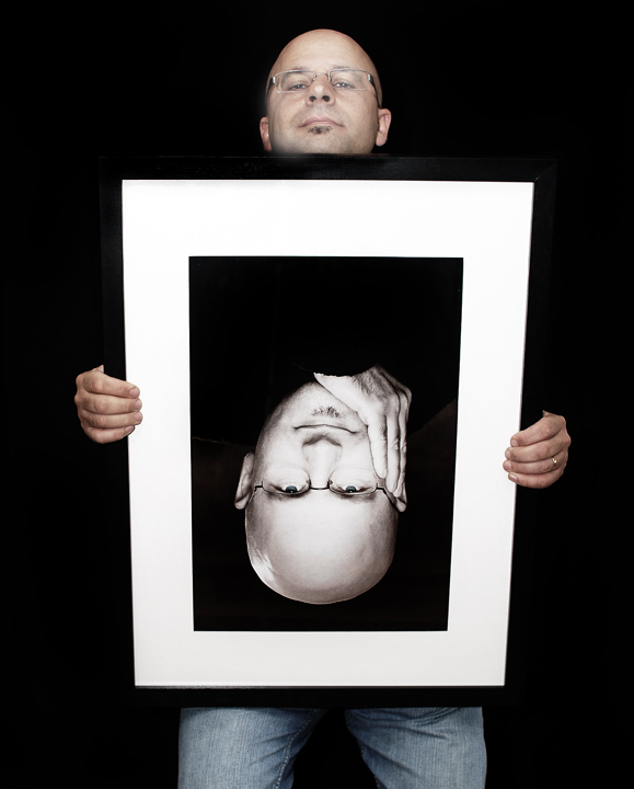
Composition/Content Actually, there is something I'd like to say. Had you been able to get your camera higher up, I think you could have really improved the composition of this one. As it is, there's just a *little* too much distortion here, and your struggling to look over the frame draws too much attention away from what you are trying to achieve. Had it been a more comfortable pose, with more symmetry between the real you and the framed you, I think this would have been a much stronger image, and a much higher score. Heck.. just the portrait of you in the frame is a 6.x scoring photo in and of itself.
Background Nicely done and solid black background which really helps highlight the frame. One suggestion would be a mottled grey background, so that the frame wouldn't have disappeared into it so much. Of course, that all depends on *having* one :)
Camera Work/Technical Nice lighting, good exposure (maybe slightly light on the real you). You seem to lose a little bit of focus in the face of the real you, however, so a deeper DOF would have been recommended. Say, f/5.6 or 6.2 or somewhere in there. (which would have helped the lighting on your skin-tones as well.
Digital Processing Good work on the processing. No visible marks, everything seems really solid. A little more selective sharpening on your real face might have helped though. Now that I noticed it's softer, I can't seem to move away from that.
Fits the Challenge Doubly so :)
My Opinion of the Photo A fantastic concept and well pulled off. As I said, having the camera up just a little higher, or having yourself not looking over the frame so much would have really grounded this for me, and maybe for the voters as well. As it is, you have a fantastic score, but a couple of elements kept it from the ribbons.. which could have been attainable IMO.
One of my favorites! I like the contrast of color and b&w. The whole image seems to illustrate a them of constrasts to me. The idea itself is well done. Great job!
Great concept here. I like the simplicity of the composition and the lighting is very good. The black background works very well to isolate the subject. Great photo which is being held upside down too.
Great idea and well photographed. My monitor is 1152*864 and without hitting F11 I can't see your jeans without scrolling down. imho I prefer the shot cropped at the bottom black frame without the jeans.
Ya know, I really like the portrait within the frame. Not sure if there is a specific reasoning for not entering that one :o) The one in the frame would have gotten a 9 from me....as is...a 7.






 Add photograph to your favorites
 Add photographer to your favorites

 Photographer found comment helpful.


