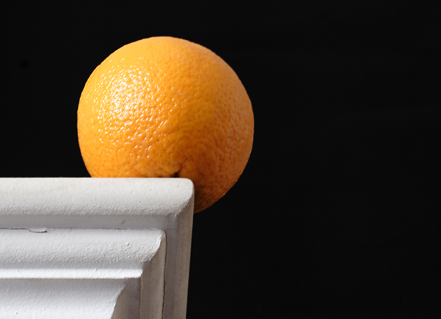
This is a very elegant, very simple shot. I love everything about it. I love the sharp contrasts between the shelf and the dark background. I love how the orange acts as an intermediary between the white and black. It also grabs your eye and holds it. I love how the lines of the shelf lead your eye right to the orange even if it isn't needed. Incredible use of lighting though the hot spot on the orange does detract a little.
Only little nitpicks that I have. The orange could have been placed so you didn't have the dark spot at the bottom of it showing. The crack in the paint on the left side is a tad bit distracting. And as I mentioned above the hot spot on the orange.
Incredible shot for a first entry!
Why didn't this score better? Only the voters know for sure...
TC
Nice composition. In this case (unlike so many other's I've seen) the negative spaces to the right adds to the composition because it give the orange somewhere to go if it falls. Good job.






 Add photograph to your favorites
 Add photographer to your favorites

 Photographer found comment helpful.


