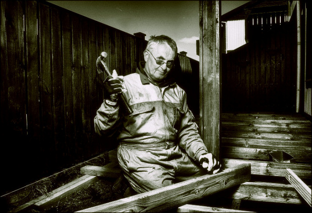
First Impression - the most important one: Coy and cute.
Composition: Very centred ... less of the fence on the left side would not have reduced this picture at all .. and would have allowed you to make him slightly larger and give more impact.
Subject: meets the challenge and edoes so with flare.
Technical (Colour and light): This is one area I didn't mind the post processing ... is a little too much like a painting for me .. but still works as a photo ...
To grow its vote?: looking at the winners of this challenge .. cropping him differntly would have worked wonders ... e.g. inclue the hammer and lower hand .. out past the post slightly so you know that hes building ... and slightly closer to the top of his head.
Summary: Great work .. keep it up .. you are definately going places.
If you've got any questions about this critique, please feel free to contact me via the PM system.
He needs to be looking at that nail, rather than the camera, surely, or his next portrait will be in x-ray form. It's also a bizarre way to hold a hammer in the first place. Like the details, but not the processing.





 Add photograph to your favorites
 Add photographer to your favorites


 Photographer found comment helpful.


