Greetings from the Critique Club!
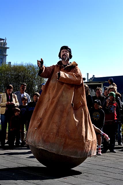
First off, great photo. I like the oddity of this shot a lot. What hurt you the most was this being a bit of a stretch on the challenge theme. Chaimelle said it perfectly in her comment so I won't go further there.
Technicals:
The color was captured well from the sky on down. The lighting on the main subject is also good. Although I wish the crowd was better exposed. That might have been difficult to accomplish in-camera but in post editing it could have been improved using masks and curves.
Subject/composition:
I like the choice in subject. You definitely captured him in his element but as mentioned before it feels more like a candid than portrait. In terms of the composition, I liked the choices made. I only wish the build on the left wasn't there. Maybe a different angle would have eliminated that or minimized it to the point it could easily be cloned without any worries of a DQ. Personally, I think you could have gotten away with just cloning out the building as is since it takes up so little of your shot. However, to be safe I'd ask an SC about that first before doing that in the future. Just something to consider. |





 Add photograph to your favorites
 Add photographer to your favorites

 Photographer found comment helpful.


