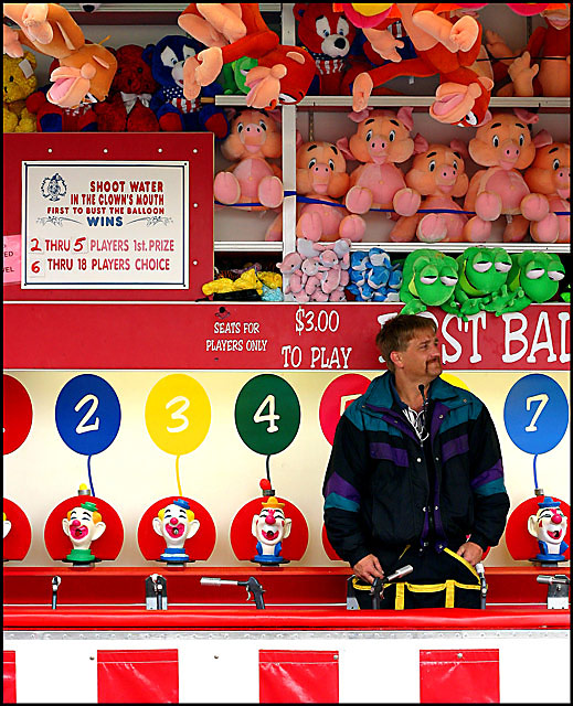
We had a little carnival in our local WalMart parking lot. THey were setting up for the day and I was able to get one of the games guys to pose for this shot.
Very little postprocessing. Cropped, levels, saturation, unsharpen mask, border, save for web, unsharpen mask again.
Statistics
Place: 86 out of 190 Avg (all users): 5.7340 Avg (commenters): 6.3000 Avg (participants): 5.5909 Avg (non-participants): 5.8029 Views since voting: 1311 Views during voting: 297 Votes: 203 Comments: 18 Favorites: 1 (view)
I like this shot. The colors are good, the composition too. I might have liked it better if it were cropped a bit on the bottom so you could get in tighter on his face and still get the prize toys in the shot.
i really like this shot. i like that he is looking away for the portrait. some may not but i think it is fitting in this situation.
i think the bottom of the counter would have been better left out. i seem to be drawn to the white/red square combination. that takes away from the actual man you are portraiting.
this is a nice image and fits the challenge,
the composition could be improved, the man looks outside the frame wich is bad, if he'd look the other way the image would be much better,
and there is too much space above him, crop the image below the top shelv and you got a good shot.
I like the composition and color you captured here but I suspect some would have preferred the subject appear as though he knows he's being photographed. I'm sure you probably heard "looks like a candid" a few times. This shot does indeed, though, put the subject in his "environment" and quite the colorful environment it is!
I rated this as one of the best in the challenge. Does a portraite have to be lloking at the camera? I am not so sure - this seems to have counted against you. Anyway a great picture in my book. Well done.
Trading post...
I voted this a 7 in the challenge. The title is excellent. The colors are vivid and the details are great. The thing that would have made this better is having him look at the camera. There were a lot in this challenge that didn't and I think they were scored down because a portrait is supposed to be posed.
trading post I love the composition of this, with the prizes and game framing him; and the pose works well- kinda in between candid and a very posed portrait. The colours work well to give context to the fun, colourful fair. Contrasting with that the guy's expression shows him as a normal guy, who has a life outside of his work.
You could do with some more lighting on the guy, but I guess you couldn't help that.
I like it. I think it would have scored much, much better if you'd gotten him to look at the camera. As it is, it looks more like a candid than a portrait. Still, one of the better ones in the challenge.
Plenty to look at for interest in this shot! Good color all around. To me, this photo would pop a bit more if the booth worker were looking at the camera.
Sorry but this is hardly what I would classify as a portrait, more of a street candid BUT I wonly deducted one point since I realize different people may have different opinions of what is a portrait and this certainly is a picture of a person. As a photo it´s nice but still, nothing that is making my jaw drop, somehow the man blends in too much and doesn´t stand out, the image is too busy for my taste. 5 from me.







 Add photograph to your favorites
 Add photographer to your favorites

 Photographer found comment helpful.


