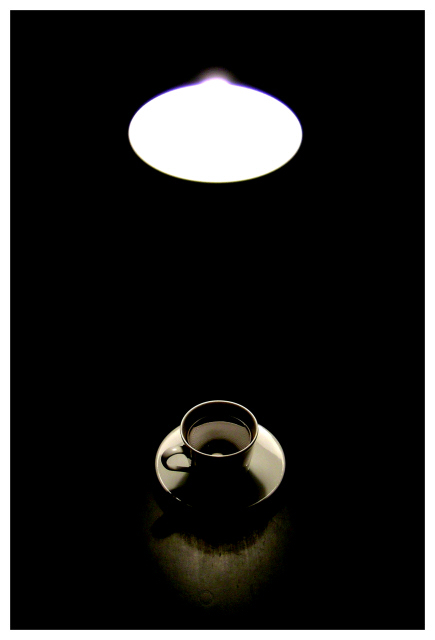
Thinking about the idea of negative spce, the idea of separation was what seemed most prominent to me - and here's a rather poor attempt to show that. Given time and facilities I'd have tried to get s shot of someone standing in a theatrical spotlight - but time forbids, unfortunately.
The slight light flare at the top is essential to this pcture (expecting it to be criticised!), as without it the light becomes just a white oval and meaningless.
I have had another idea - but weekend commitments make that impossible to set up, which is a shame as it's rather a good one, I think. It'll fit some other challenge, I'm sure.
This is shot in my hallway, which is lightless with all the doors closed, though a bit cramped for space. Levels adjusted enormously to black out everything, and to get the highlights up.Annoyed with the jaggedness of the rim of the cup, but couldn't solve that at this image size without softening the whole thing too much.
lacking inspiration, I fear, but it is at least a submission.
Statistics
Place: 31 out of 141 Avg (all users): 6.0963 Avg (commenters): 7.9333 Avg (participants): 6.1236 Avg (non-participants): 6.0435 Views since voting: 1439 Votes: 135 Comments: 17 Favorites: 1 (view)
Thanks for the comments - yes, basically I agree that it would be better without the light, but the negative space wouldn't be such a strong element of it without the light. Without the glare from the light that would just be a white oval.
Wish I'd had time to re-shoot - I'd have lit the shade of the lamp a little too, just to give some definition. Ah well.
I like the idea here, but I like the photo better when I scroll so that I can only see the coffee, not the light. The light doesn't seem to add much - and the difference in brightness between it and the cup and saucer is pretty marked.
I like the balanced light areas with the surrounding blackness. The coffee cup is a little indistinct - I think seeing it in a larger format would help, but we just have 640. I like it.
I like how the neg. space stands mostly between your two objects, adding a sense of mystery as well as some kind of 'connection' between them. Nice lighting. 9
Oooh, like this idea. I really, really like the toning and shading on the coffee cup - so much in fact that I'd have seriously considered cropping just below the light. If cloning were allowed, I'd just nuke the light and keep the framing the way it is. As such, minimizing the chromatic aberration on the light by desaturating the blue and magenta channels would have been something I'd have considered. Still, excellent.
This is great! (not you Tarique, is it?). This is real top stuff. The only thing I can think of, is having that slight glare bump on top of the light circle (on the top) removed. I only say that, because the rest of it is made of of very clean, smooth, geometric shapes. The symmetry works well with this too. 9






 Add photograph to your favorites
 Add photographer to your favorites


 Photographer found comment helpful.


