Thanks to the critique club ,for the comment ,i havent got that much expirience and missunderstood the challenge .But point taken ,we learn every day .
First off, always try to include some info about the shot in the Photographer's Comments section. It really helps out when we know what the photographer was thinking and what equipment/lighting/etc. were used, especially when you request a critique.
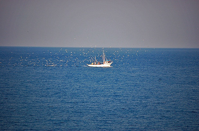
Camera Work/Technical: Your horizon is tilted. While not everyone is like me (and probably for very good reason), that is the first thing that jumps out at me, thus is one of my pet peeves. Always make sure the horizon is, well, horizontal, unless you are going for a tilted effect. Here, it looks accidental rather than intentional.
Lighting: Very nice lighting. Everything is evenly exposed and nicely toned in this image. You managed to keep all the detail in you darks without blowing out your lights. Nice work.
Composition/Content: Everything is dead centered, leaving the eye very little room to move around. The trail of birds helps to move the viewer's eye around a bit, but not enough to overcome the centering. Try using the rule of thirds for your subjects and you will produce some much more interesting images.
My Opinion: I agree with most of the previous commenters that this isn't an environmental portrait. It surely would have placed better in a different challenge, but, to me, and environmental portrait includes a person surrounded by their work or play environment with their face showing. Not a bad image, but just not suited for this challenge.
DNMC--not a portrait. I like the idea of the birds and the boat, but I wish it was closer so more details could be seen. I like the texture of the water and that there is no glare.
You have a little stuff on the lens there (or sensor). It's not really a typical portrait, and I can't really tell what the subject is supposed to be (the birds, or the people on the boat?)






 Add photograph to your favorites
 Add photographer to your favorites


 Photographer found comment helpful.


