Interesting to do a critique on your image but it is difficult if you don't give us any information in your photographers comments. When we do a critique, we go past just the photographic result, that's what voters comments do. The critique looks at what you were trying to achieve, how you wanted it to look and what issues you had in getting the image captured and ready for voting.
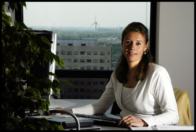
First Impression - the most important one: Beautiful model .. but it does take more than the model to have a fantastic shot.
Composition: This is fine ... the DOF is ok ... could have been shallower allowing more blurring of the background to make her the only focus instead of doing what I do in my office and staring out of the window.
Subject: meets the challenge .. and meets it well ...
Technical (Colour and light): This is where your issues were. I am not sure if you had access to additional lighting at work ... or anything as you have not added any comments to assist is what you were looking for in the shot.
Office lighting is harsh at the best of times .. and with only half the face lit she this picture is not as flattering or beautiful as it could have been.
To grow its vote?: Check out those who score higher ... see what the differences to your shot were .. and think about how you can add more interest into your shot. unfortuantely ... shots at the office in this challenge .. didn't seem to do great.
Summary: You done good ... she looks lovely ... and comfortable (my workmates hate me taking their pics).
If you've got any questions about this critique, please feel free to contact me via the PM system.
Your light is to far to the side. The shadow from her nose and lips is distracting. You need to either raise the light up and move it closer you you or move it more to the side to get true side light so her whole side of her face is shadowed. Also the ratio of light to shadow is a little to high. You needed to bump up your fill light a little.
This is a very nicely done Environmental Portrait. I think it's pretty much perfect just the way it is! It would kind of been interesting to use a wider aperture to throw the view in the window into just a bit more of a blur, too.
This is good lighting and portrait. It's not going to set the world on fire abut it has technical proficiency that is quite excellent. Unfortunately DPC voters won't recognise this






 Add photograph to your favorites
 Add photographer to your favorites

 Photographer found comment helpful.


