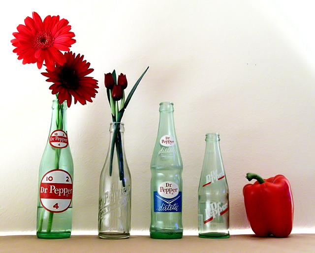
When I was a kid, my parents liked to go to antique shows, and digging through the glass bottles for Dr. Peppers was introduced as a way to keep me entertained since they tended to be a little more rare than Coca-Cola but not so rare that they were impossible to find. These four are my favorites from my collection, ranging from about sixty to just eight years old.
I threw the flowers and the red pepper in, not just for balance and a touch of humor, but as a nod to the flowers, fruits and vegetables that star in nearly every classic still life painting you will ever find. The wooden tulips are a tribute to my Grandma who was a painter - they were once hers. I hardly expect anyone to know that without being told, but they add much needed height to keep the descent relatively smooth. Of course, the pepper isn't just the vegetable element, but a visual pun.
Figuring out the lighting was tough. My dining room table was pushed up against a wall, but the espresso finish of the table was too dark so it was covered with plain brown paper. The light had to be low and extremely indirect to keep glare off the bottles, but the exposure had to be long enough to turn the low lighting white. This was not an easy feat, but it was accomplished with desk lamps, wax paper "diffusers", and a little bit of box tape.
For once, post-prod was the easy part"
Crop
Brighten
Contrast
Increased Green Saturation
Neat Image
Save for Web
You would think it would be more, but this really was all the tweaking necessary.
--
I learned a lot about lighting on this challenge, and have some ideas on how to make it better. I'll shoot it on white paper so there's no line of light seeping up from underneath - I actually quite hate that about this version, but there was nothing I could do about it at the time. I think it's a very marketable image concept, so I'm going to reshoot it and see exactly how much I have learned.
Statistics
Place: 79 out of 338 Avg (all users): 5.6826 Avg (commenters): 6.5833 Avg (participants): 5.5176 Avg (non-participants): 5.7793 Views since voting: 1250 Views during voting: 341 Votes: 230 Comments: 20 Favorites: 0
Very cute Idea. Now I'm thirsty for a Dr. Pepper Ü. I like the repetition of the color red through out the photo, and the descending heights. Very nice composition.
The lighting is a little 'off'. The shadows on the background are a little uneven. And the tulip buds could be a little brighter.
Nice photo over all!
First Impression: Funny and clever take on an original subject.
Composition: Very nice, with the descending line from left to right, well balance with the red on both sides.
Subject: Funny, original. We don't have Dr Pepper on Spain, but they look antique.
Technical: as you say, the lighting can be improved, the shadows of the wall are, at least, strange. Colors are very natural.
Improvement: As you said, lighting. Hoping to see your new versions of the shot.
Summary: Funny, good composition and some flaws on the light.
I like the bottles (my dad collects old medicine bottles. the splash of red makes it an interesting photo. It would have been dull otherwise, I think.
The comp is ghood it leads one to the red pepper. The flowers are very pretty:)
Technicals: The lighting on the bottles is really good. I like the soft/diffused specular highlights. I kinda wish the pepper had some of that on the front side of it like the bottles. I always picture peppers being shiny so this one feels a bit dull in comparison. The shadow cast in the background feels a bit out of place but it's not too distracting.
Subject/composition: I like the choice in subjects and how you arranged them. I don't think I've ever seen those old looking Dr. Pepper bottles before. That really adds a classic look and feel to the image as well as the addition of flowers.
Suggestions for Improvement: I like it the way it is but to do better in the challenges I think the back wall needs to be more evenly lit without that shadow and a shinier pepper would have really sealed the deal with voters, IMO.
What I like: I like the technically well lit, well focused image. I like the balance of the reds in opposite corners. What I think could be better: the objects look too linear to me. I think the arrangement could have been better if the objects were on different levels to allow them to be closer together. Just my .02 7





 Add photograph to your favorites
 Add photographer to your favorites


 Photographer found comment helpful.


