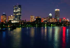
Nice city shot, but could've done with a larger photo to see it! For the future, perhaps taking the photo at a later time would create more of a contrast between the lights and sky. 6
Image is way too small to ever have been considered for submission to this challenge. Even so, I see noticeable camera-shake, and there's too much water at the bottom of the frame. Try harder next time.
By this time, I'm sure you've been pounded to death with "size" comments so I'll spare you. ;-) This looks like a potential killer image of Boston. The colors are richly saturated and the sky is an amazing gradient that looks perfectly dusky. The horizon looks a bit tilted, which in a larger format, would be very annoying and cost you voter points. Though it's tough to tell at this size, I think your focus and sharpness are spot-on. If this image had been submitted at the full 640px, I'm guessing you would have had a top 10 image here, maybe a top five. Live and learn my friend. Study up on how to size those entries correctly for DP challenges!!
It's better to submit shots at the maximum size allowed here--it's hard to see what you have at this small size. Check out this tutorial about sizing your images for challenges.
I wounder how many comments you'll get saying 'too small'. I'd have to agree, I can't see why you haven't used the max 640px available to you. Is it the file size? Then reduce the quailty in Photoshop. Quality of between 60 and 90% is fine for DPC, but allows bigger images sizes. I suspect this would do well if it was bigger. (4) - sorry, needs to be bigger to see the image better.
Oh no!!! I'm sure you'll get countless comments but it's just too small. This could be an awesome shot if it were bigger. I'm going to give it a 6 anyway because I feel that it will suffer unfairly for not being large enough.





 Add photograph to your favorites
 Add photographer to your favorites


 Photographer found comment helpful.


