HI Greetings from the Critique Club.
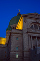
What I like is the choice of subject, great place, so much texture and detail, also what i like is the odd 'silo' type thing on the far left, what an odd and interesting contrast in architecture styles!!
I think you shot would of hugely benefitted from rotating it to the right, or holding the camera straight when you actually took the shot. As is the building is crooked, which is a little unsettling. After the rotating I would of cropped a wee bit from the right. The other aspect that may have added something to this shot would of been someone going up the stairs perhaps? Someone kneeling? Other wise nicely done IMO.
Just some thoughts hope they help.
Lynn
Very pretty structure, but appears tilted probably due to the perspective. You may want to try shooting more to the left of where you stood to get rid of the smokestack.
A grand building. A shame the sky wasn't kinder to you on the day. I think it may have helped by cropping the chimney out of the left side of this pic and maybe squaring the horizon too.
Very cool subject, with good color and detail. I'm sure you already have comments about the rotation- it's not enough to appear intentional and too much to appear normal. Pity you couldn't find another angle or at least crop out the distracting smokestack.
Beautiful subject and you have done well to not overexpose. I would like to see a different perspective or a tighter crop to remove the object on the left of the photo. I find that the object pulls my eye away from the mosque.
An amazing building, shame you didn't make sure your photo was straight (a slight rotation is all it needs). Composition could be improved by cropping out the tall smoke stack on the left and maybe even getting closer to show us some of that amazing architecture. You don't have to fit the entire building into the photo, sometimes a closer look is better.
Nice shot. The tops of the mosque look like they're leaning to the left. It would be nice to spot edit out the smoke stack, but that's not allowed. Maybe a different angle next time (of course, we don't see whats on the right which might've been worse).
The building appears to be badly tilted in the shot. Even though the hedges in the foreground are level, I think it would be more effective to level the building, since it is the main subject. Interesting place.
This is very nice. Only thing I would have done differently is to straighten the picture (rotate 2-3 degrees clockwise) and then crop out the tall pipe on the left. 8 from me!
Love this photo, but the receding line of the bushes on the right and the gray pillar on the left are distracting to me... I think it would look better with these two elements cropped out. Still great though.
Building seems tilted to the left. Need to correct this, plus the industrial smoke stack takes away from this beautiful building. Perhaps a different angle to remove the stack? Wonderful detail in the architecture, and lighting is perfect.






 Add photograph to your favorites
 Add photographer to your favorites

 Photographer found comment helpful.


