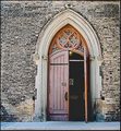
I had a lot of photos to choose from and this one might seem kind of boring, but the others had stuff wrong with them. Like big chunks of dirt in an otherwise great reflection. Took the whole family on a road trip that day: parents, sister, daughter, dog. Broke into a church for interior shots. Laid down on graves too to get some headstone shots and one footstone shot, but none of them really looked Holy. So back to the boring side of the church shot at Rose Hill. A lot of post processing adjustment layers to get it to look all dark and burny like this.
Statistics
Place: 153 out of 250 Avg (all users): 5.1245 Avg (commenters): 5.4444 Avg (participants): 4.8023 Avg (non-participants): 5.3032 Views since voting: 619 Views during voting: 320 Votes: 241 Comments: 11 Favorites: 0
Interesting image. What I like best is the detail you captured on the roof and how you enhanced it in PP. By itself it would make for a good texture image in it's own right.
As for the rest of the image, it looks fine however the grass kinda bugs me to be honest. I can see you did a lot of burning but I don't understand why you did more of it on the right side and not the left. If you wanted to leave in some detail I think you shouldn't have burnt the grass tips so much that way there wouldn't be that harsh transition in the grass.
Overall, the image is good. I think you did as much as you could to bring out it's appeal. However, I feel that appeal was simply limited. What might have produced more appeal would be to have more of the roof in the shot (wider angle?) and if there was a cross up there to have it in the shot as well. I just don't feel that these windows have enough appeal to carry the shot by themselves. Maybe if they were stained glass that would have been a different story.
I love the effective understatement of the gothically arched windows. If it were not for them, you could have substituted 'cottage' for 'church' in the title.
Interesting subject and good texture. I might like to see the wall darkened up a bit as it seems a bit overexposed and it might be neat to do a tight crop on the windows. Nicely done.
When I first glanced at this, I thought someone was standing inside, behind the middle window....a bit spooky. But on closer examination, I realized it was just the window on the other side of the church.
lol - guess I need my glasses adjusted.
Not sure if it is slightly out of focus or if it's the post processing creating that effect. The textures are nice but it is sort of a bland photo with not a lot of interest.
I like this for it's simplicity. Nice lines in the composition. The repeating pattern with the windows works well. Borders are usually a give or take with me. In this case a border might have helped to "contain" the image some. Just a thought. Good luck in the challenge.






 Add photograph to your favorites
 Add photographer to your favorites


