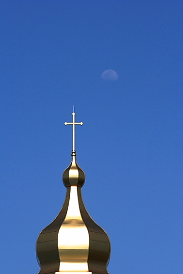
I would have loved this picture if the moon was a little more developed. As it is stellar photo, but there's so much negative space (mind you, negative space can be an amazing aspect to a photo, but I feel it's just too empty in this shot.
I do like the simplicity of this shot very much, but feel that a different crop would have helped the composition a bit. Shame too that you've lost some detail from that front parapet panel due to the highlights being blown out. Still one of my higher scoring shots in this challenge.
Great crop, would of been just abit nicer if there was more of the moon, abit more visable i mean. Obviously there's nothing you could of done for that.






 Add photograph to your favorites
 Add photographer to your favorites


