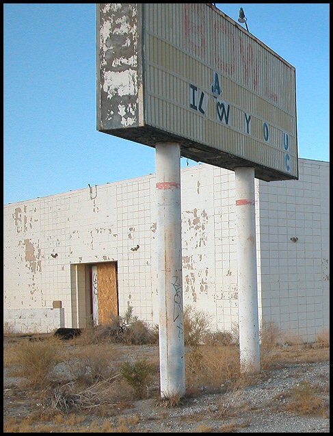
Very nice capture...something's missing though and I cannot quite find it...maybe the signb being cut off at the top, maybe the angle (looks a little slanted), or maybe should be a little farterh back. Great idea.
very desolate indeed. the sign nails it. good use of negative space, a good choice of angles. (i think the of-level quality works, but others will disagree) the colors are beautifully near-complimentary. eight.
Wow. The peeling paint, the empty building, the brown weeds, the faded grafitti create a powerful emotional vacuum that trivializes the ricketty love note on the dilapidated sign board.






 Add photograph to your favorites
 Add photographer to your favorites


 Photographer found comment helpful.


