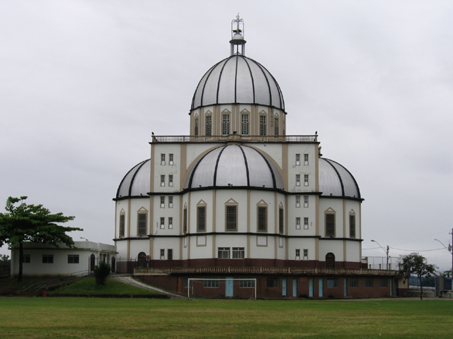
Ok, the first thing we notice is this marvellous building! It's perfect for this competition. What didn't work was the fact that the picture is fairly dreary. I think either a nicer day OR converting to black and white may have given it a bit more energy.
Also, I think that cutting out the goal post at the base of the photo might have helped us concentrate on the real subject of the photograpgh instead of distracting the viewer slightly. However, the way that you got the building right in the centre of the frame helps a lot.
Overall, I think this photo would have gone further if it had a bit more life in it and wasn't so drab. However, well done on the finished shot as it seems technically flawless.
Beautiful building, shame it was not a nicer day. I think a blue sky would relly set this off, or at least an interesting sky with clouds to add dimension.






 Add photograph to your favorites
 Add photographer to your favorites


